
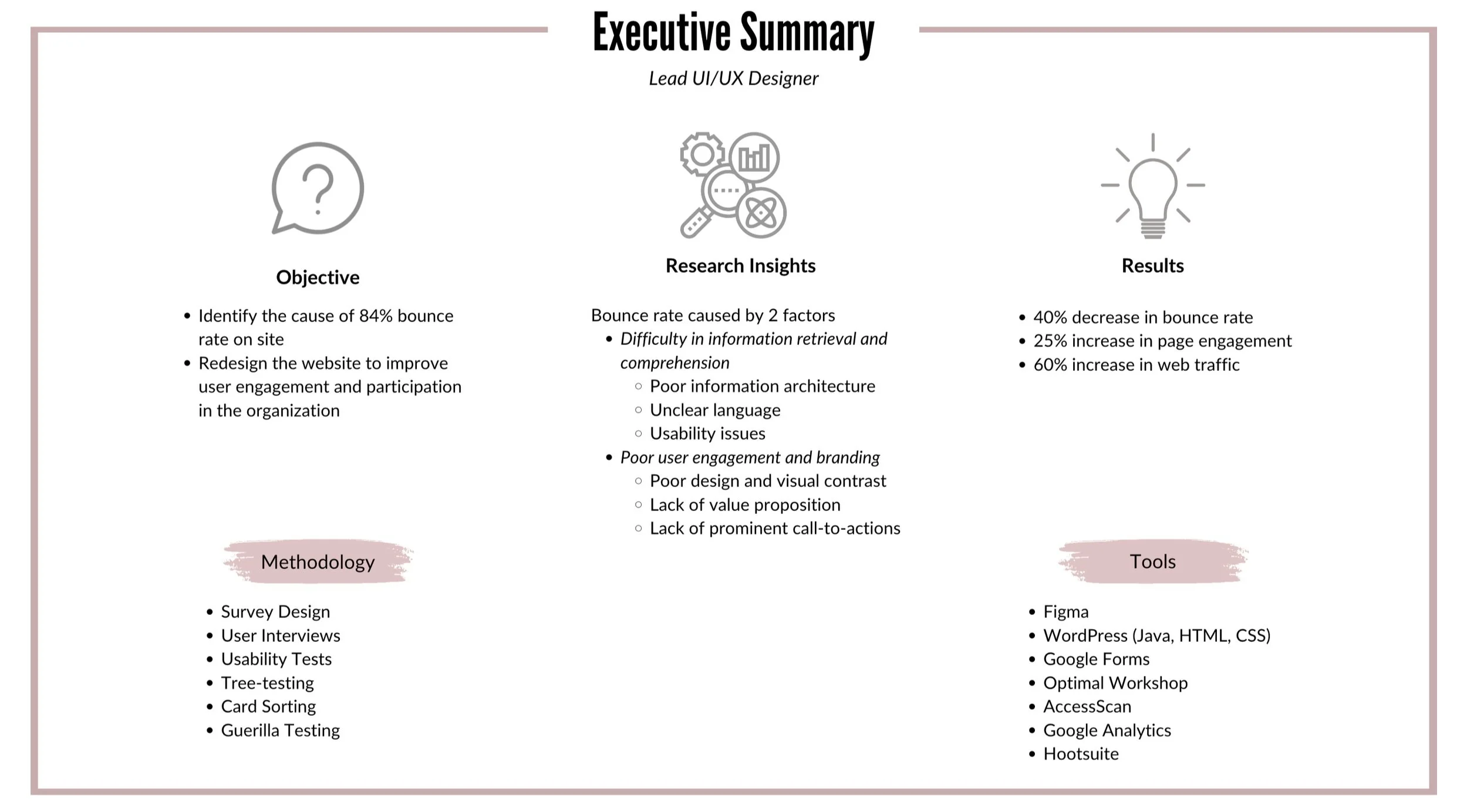
combating website bounce rate.
01
Problem statement
I signed on to tackle this issue during a 6-month contract, addressing problems that the WEDO team had identified years prior. We were aiming to fix these issues prior to November 2021 annual WEDO conference. All collaboration was handled remotely due to the pandemic time period.
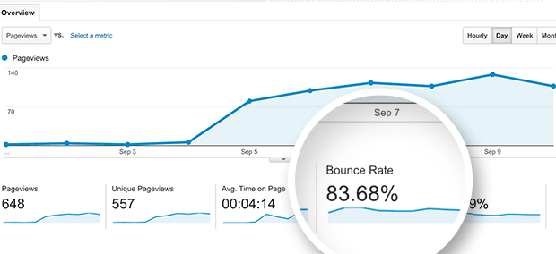
Every year as WEDO approached its annual conference, social media engagement went up and consequently so did first-time visits to the WEDO website. However, tracking on Google Analytics allowed us to identify a steep drop rate. Users typically entered the home page, scrolled, and exited before even clicking on secondary navigation.
Initial Bounce Rate: 84%
This creates a major gap in WEDO garnering brand presence, funds, and recruitment. The website needed to be strategically redeveloped.
In this role, I was brought on to
Identify the cause of the high bounce rate of the site
Based on this, redesign the website to improve user engagement and participation with the organization
02
research Insights
Because WEDO is a non-profit, we had minimal resources to invest in user research. As such we had to be strategic in our process. The first thing we decided to do was to start by sending out a survey to previous attendees of the WEDO conference. We then followed up with semi-structured interviews with usability tests. This revealed that the issues of our site came down to poor user engagement/branding and poor information retrieval/comprehension. This guided our design process. Finally, we created user personas and journey maps to better understand the user.
Targetting users through survey
We created a survey that had users rate different aspects of the site to understand what points the website was targeting well and what we needed to work on. This was sent to individuals that attended our 2021 conference as these represented a population most similar to that we would target in 2022.
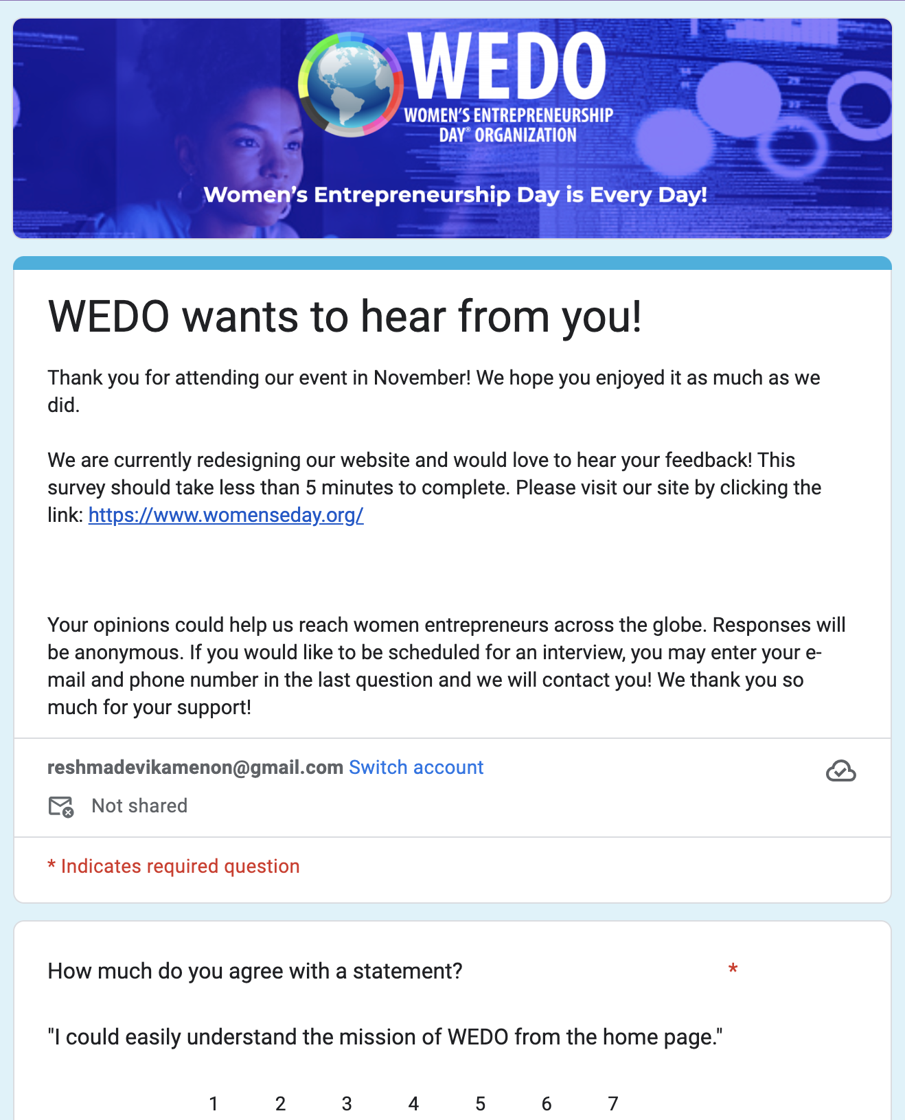
Unfortunately, WEDO had overall poor ratings across the board. without a clear focus, we needed to address most issues through additional 1:1 Interviews and usability tests.
Below are insights from our most critical issues:
Scores are out of 7
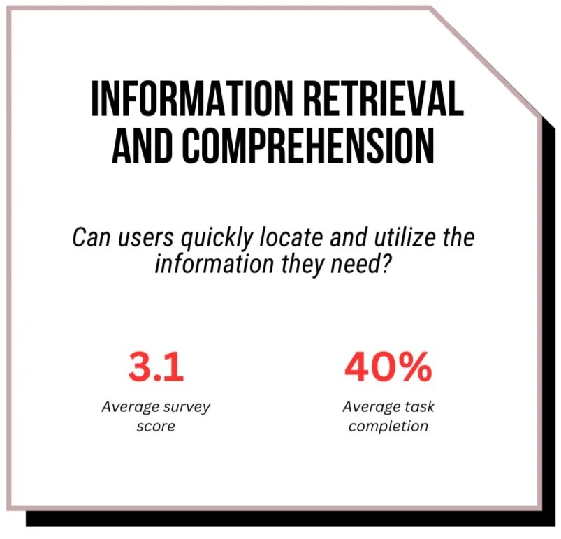
Information Architecture (biggest UX issue across)
When in usability testing, many participants displayed signs of struggle when asked to navigate to specific pages. Even those who were able to complete tasks successfully, still indicated they were guessing or not completely confident in their pathway. The site was seen as “unorganized” and “confusing.”
Unclear Language
Participants also felt that subtitles, which ideally would be helpful breadcrumbs, were unclear and increased confusion on the site.
Usability issues
Several usability issues were found, like missing or incorrect links.
Poor design and visual accessibility
Site was considered difficult to read due to lack of color contrast (too much blue), excessive all-caps fonts, and too small font. Images on the site were blurry which together contributed to poor trust and first impressions of the brand.
Unclear value proposition
Information on site often had participants asking “Why is this important?” as it lacked an immediate value proposition.
lack of prominent call to action
When participants were ready to get involved, they struggled to find a call to action on how they could get involved.
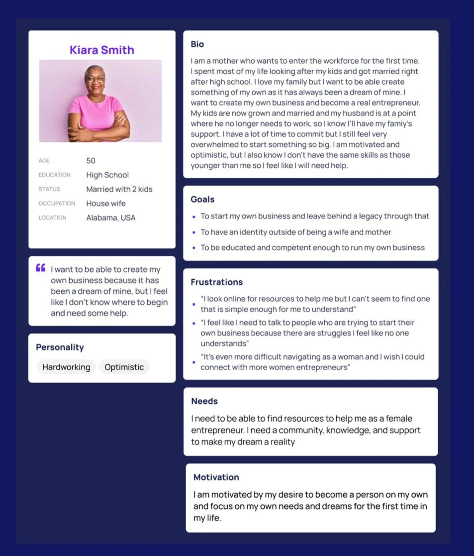
after understanding what to design, I wanted to understand who I was designing for.
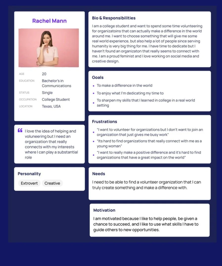
I did this by creating personas that targeted the three types of users that the client was aiming to reach with the site. Additionally, a journey map was created to better understand the process of utilizing the website. This helped to visualize any issues that would prevent the user from engaging not just with the site, but with the organization itself. The combination of these helped to frame our design decisions going forward as every user need was accounted for.
The volunteer
Depicts the type of user that uses the site to get involved in helping the organization.
The donor
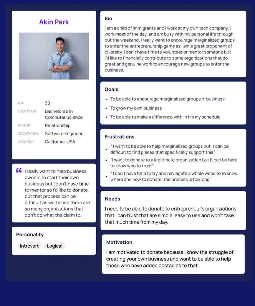
Depicts the type of user that uses the site to specifically donate to the cause.
The Entrepreneur
Depicts the type of user that is going to use the site to find information and support for her business
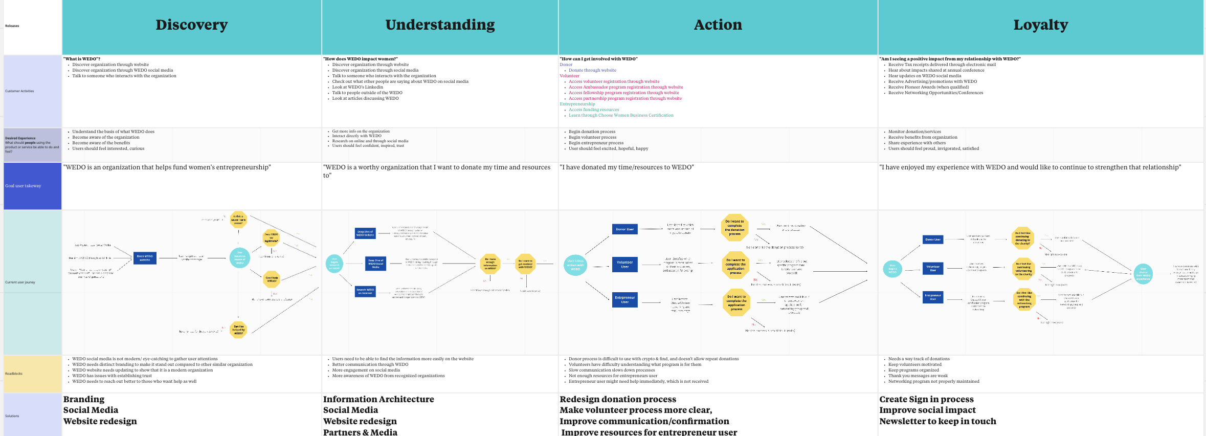

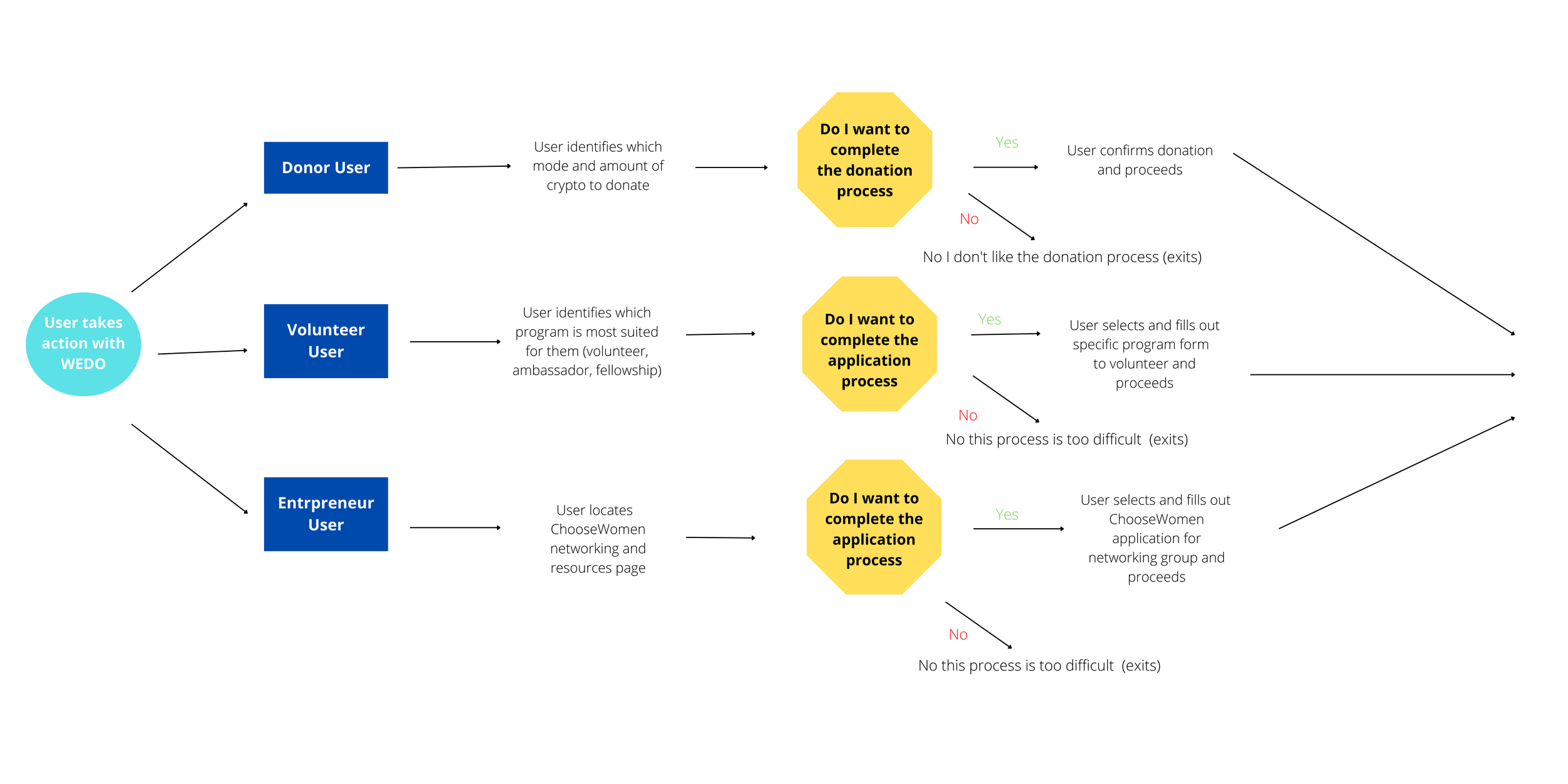
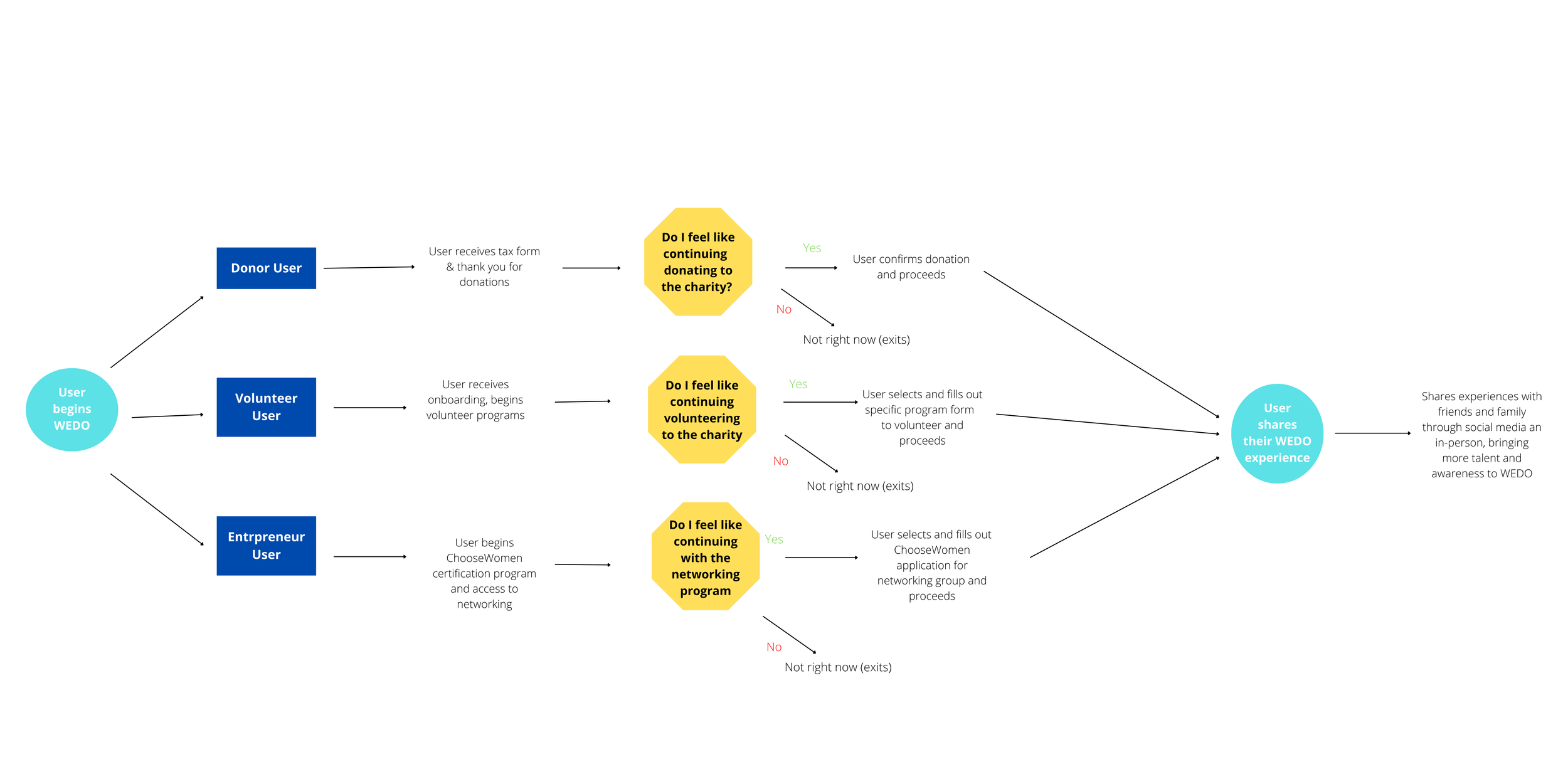
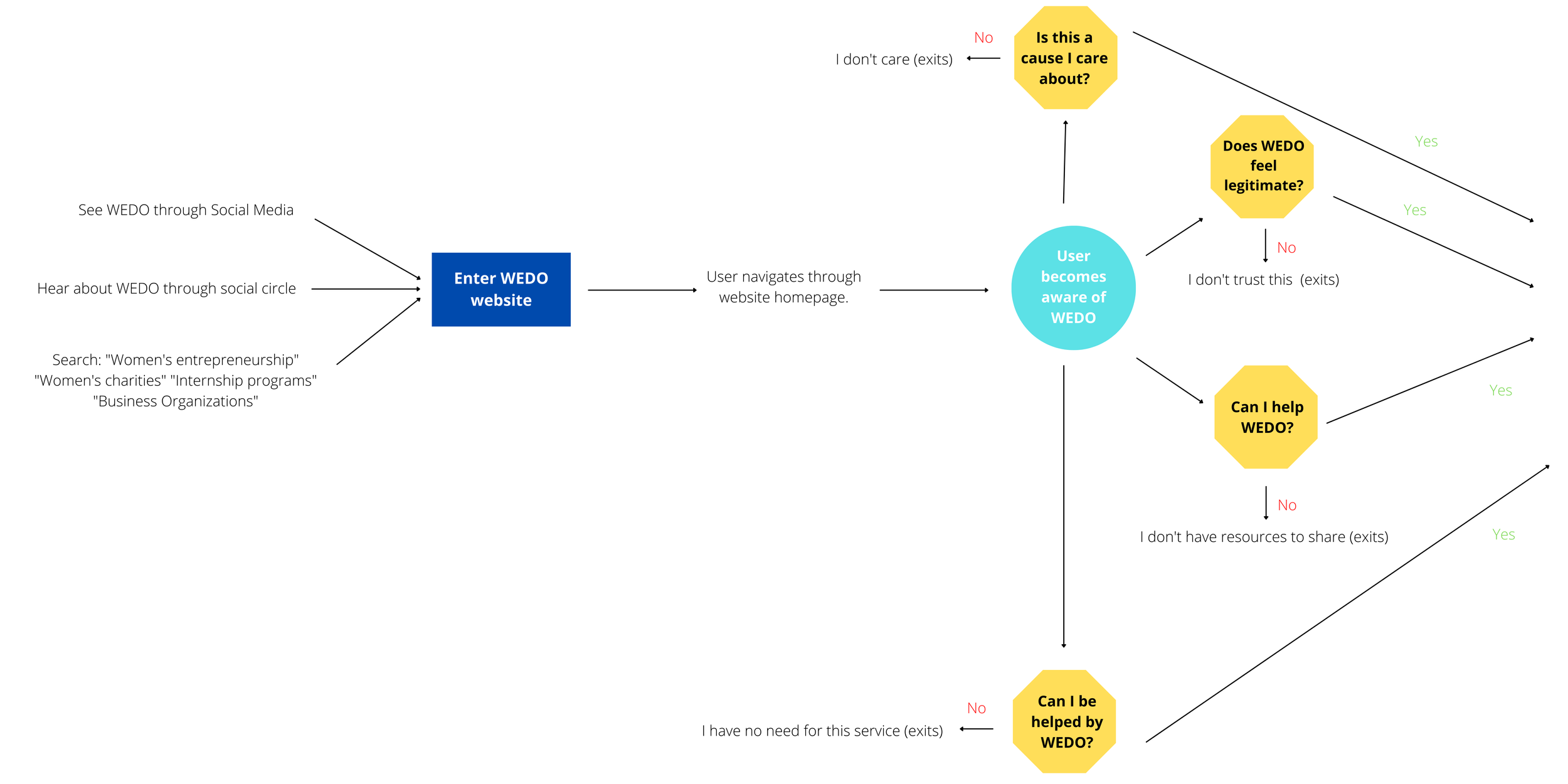
Zoomed in Journey Map
03
Information Retrieval
and Comprehension
Informational Retrieval - Users struggle to find the information they need quickly and directly. Tackled by revisiting information architecture (tree testing, card sorting, user interviews) and usability issues (plugin development, WordPress).
Information comprehension- When users reached the desired page, they struggled to extract desired information from the page due to a lack of clarity. Tackled by language revision (UX writing).

As with most information architecture revamps, we utilized both tree-testing and card-sorting methodology. Though we had already seen issues in the initial usability testing, tree testing allowed us to witness our information architecture without any outside influence. Our results indicate a majority of tasks have indirect completions, with users choosing more than one answer. Additionally, the average time spent (2:00) was slightly high for the complexity and importance of our tasks.
tackling Information Architecture
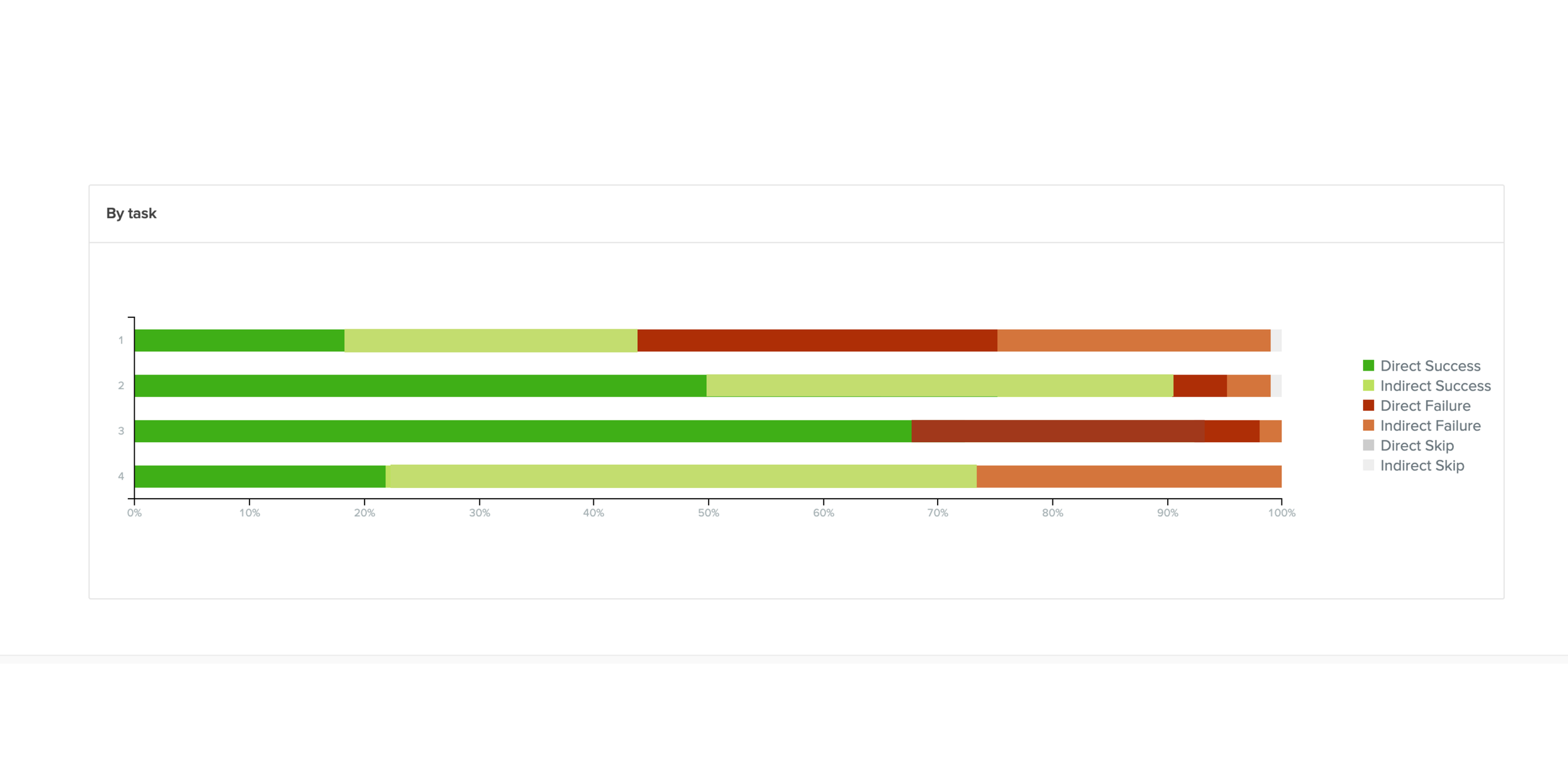
We then moved on to a card sort, with a quick follow-up interview. This brought up some interesting insights. Core information architecture was actually in line with the mental models of the participants. The majority of participants grouped the cards similarly to how it was already laid out in our original site (mission, volunteer, impacts, etc.) But then what was the issue? Follow-up interviews revealed an important distinction we missed.
our IA was not simply a taxonomy issue, it was a focus issue.
Our taxonomy of core pages made sense, but this was lost in the additional cognitive load of hacking through unnecassary and unclear navigation.
Oii
Too many pages
Too many pages were in the navigation, both in the main navigation and in the sub. This meant that users had to read through too many pages to find the specific page they were looking for. This contributed to excess task completion times and users eventually getting confused in their pathway.
What we did: We significantly scaled back on sub-navigation. Pages that were deemed unnecessary (based on both stakeholder and user feedback) were moved to secondary, hidden navigation or deleted.
unclear headers
The headers on our site were considered too vague and made users feel confused about where to begin. While the pages within the header felt like a category, the title prevented users from completing tasks quickly and directly.
What we did:
Funding Resources → Start-up Resources
Originally made users feel like this was about funding for WEDO, rather that funding for their business
Community → WEDO summits around the world
“Community” could entail any number of topics, while “WEDO summits around the world” set user expectations for conference-related pages
unnecessary header
Finally, one header was deemed confusing and unnecessary: the “Social” header. Users expected to see something about social impact but were surprised to see social media linked in the sub-navigation. Many users felt this was out of place and not an immediate need of the user.
What we did:
Deleted “Social” header from the navigation
Social Impact was moved under Impact
Social media link were moved to footer of page

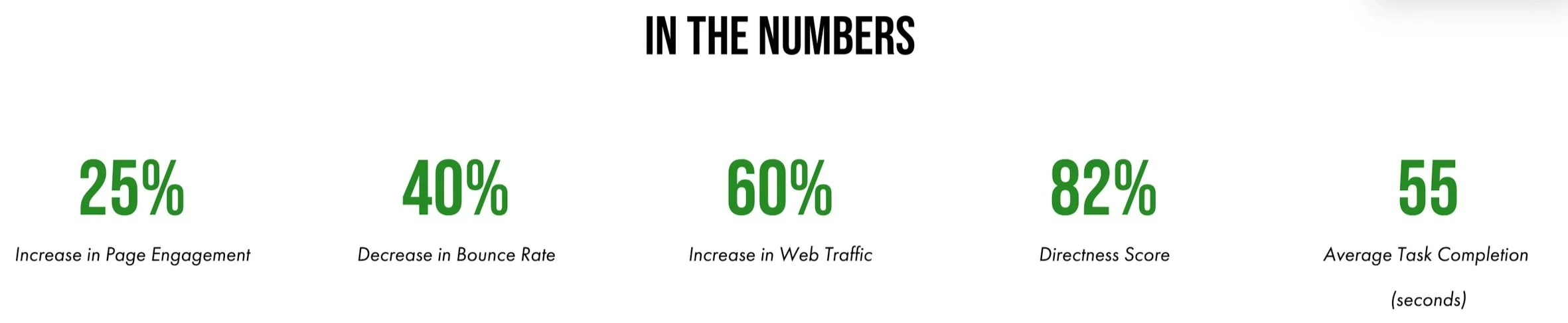
These three changes rose our directness score to 82% and reduce task completion times to under 60 seconds.
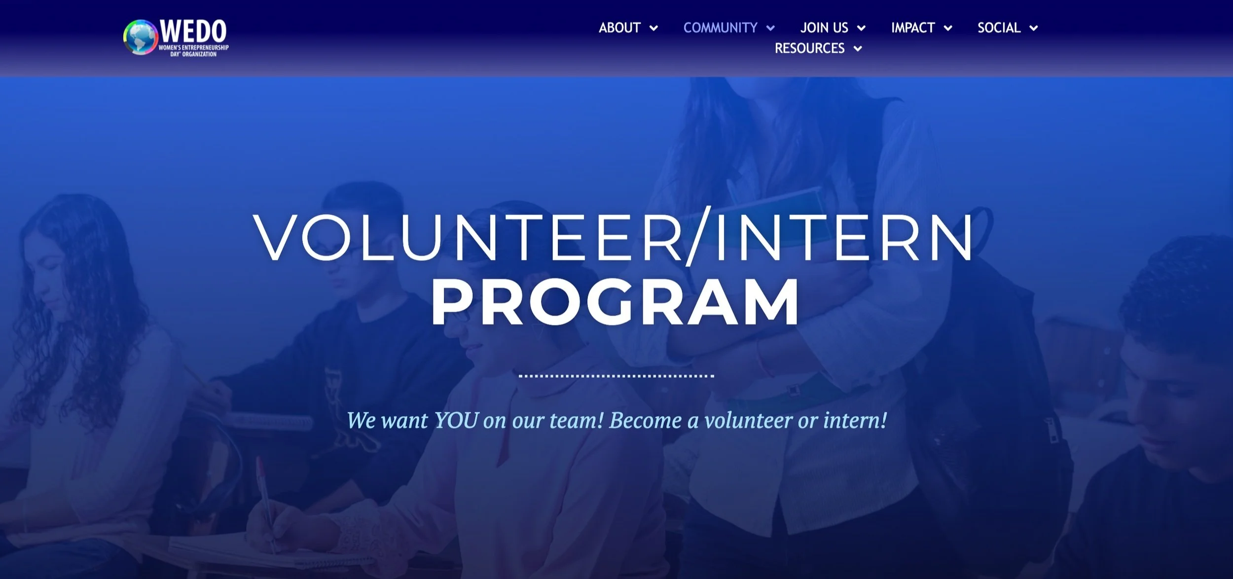
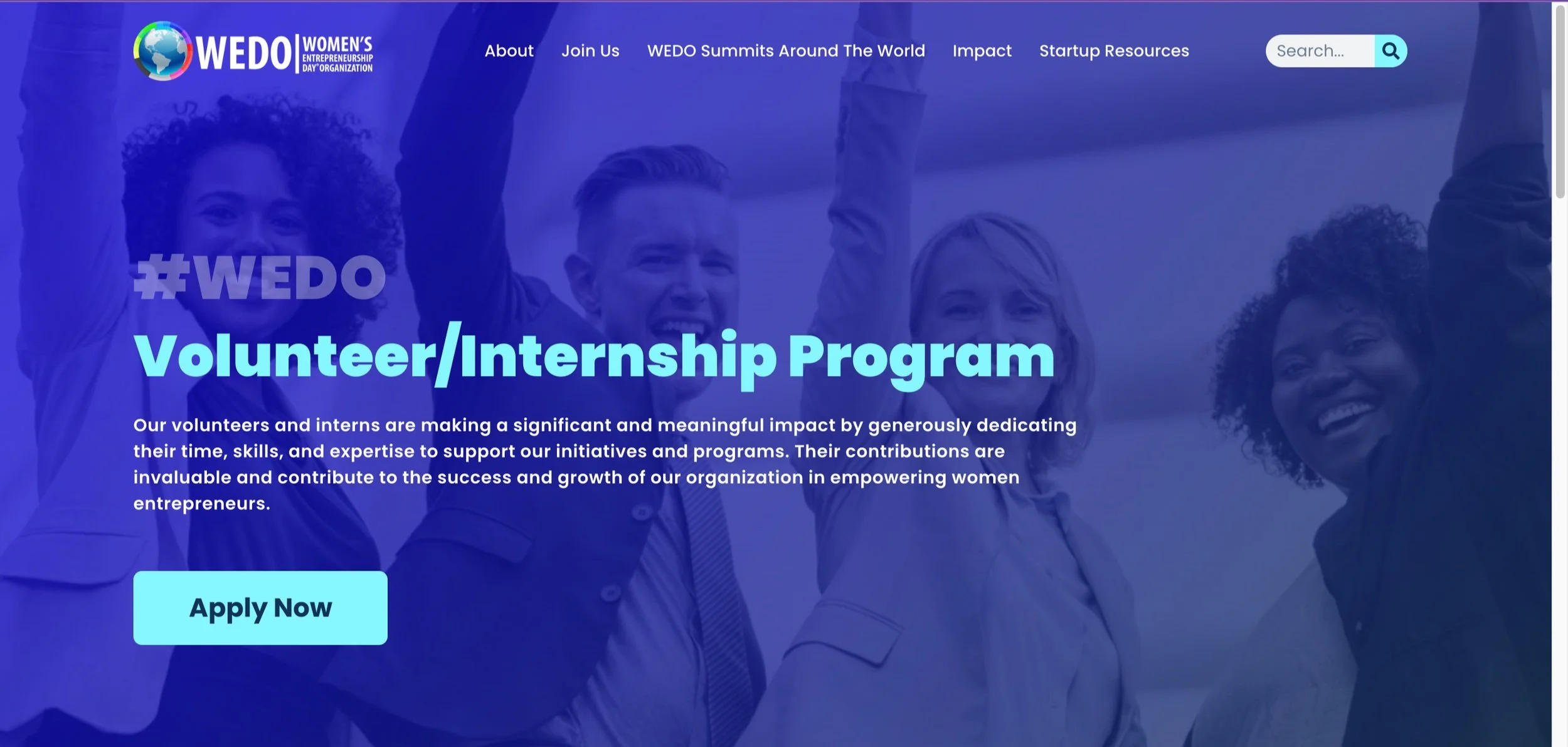
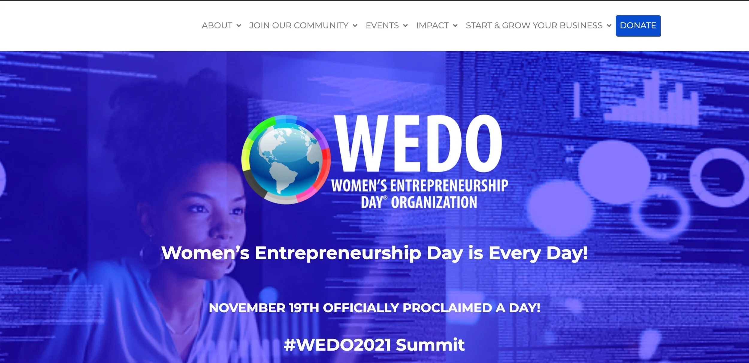
Before
After
Finally, the language and usability was fixed so the user journey would no longer be interrupted.
Language Revision to Pages
Language revisions were tackled by working with a member on our team who came from a background in copywriting. We worked together implementing UX writing pricnciples such as active voice, conciseness, scanability, etc. We worked to create a friendly, yet formal tone through out the site and ensured all subtitles quickly called out the objective of the page. We worked on over around a 100 texts, and mainly utilzied guerilla testing to quantify success due to the small size and large amount of our data.
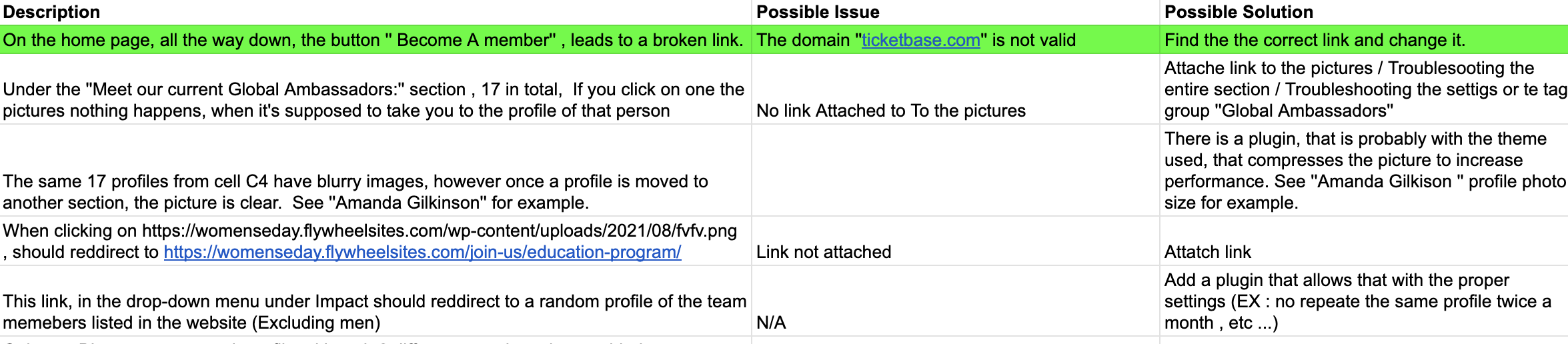
Additionally, we went over the entire site to find basic usability issues. Issues ranged from invalid links to WordPress back-end issues. These were then fixed immediately.
Usability audit
04
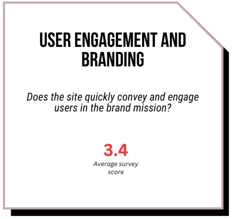
User Engagement
and branding
Design and Visual Accessibility- The site was difficult to read and exhibited poor design due to poor visual contrast, excessive all-caps font, blurry images, dated designs, etc. Tackled by the creation of a style guide and updated wireframes (Figma) and accessibility audit/corrections (AcessScan).
Value Proposition- Users could not determine the value proposition and unique branding of the site. Tackled by the revised design of the home page and additional value prop sections (branding and business strategy, front-end development, UX writing).
Call-to-action- Users had difficulty finding a call-to-action that was best for them. Tacked by introducing tiered call-to-action, formatted in adherence to the style guide for easy recognition (development, product design).
design and visual accessibility
Problem:
Users complained that the site's visuals felt unprofessional and difficult to read. Excessive use of caps, inconsistent fonts, blurry images, and lack of visual contrast were all reported. This immediately gave a feeling of distrust and caused quick exits.
Method:
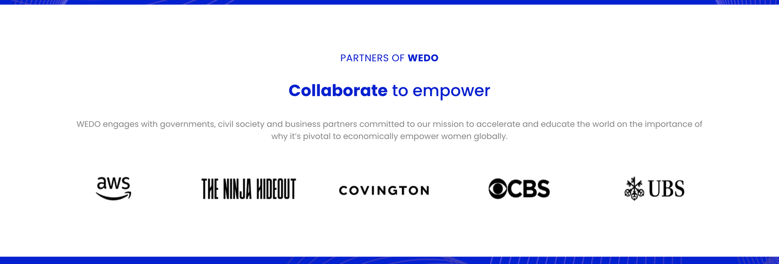
Cohesive Style: The creation of a style guide, focusing on colors, sub-colors, buttons, and fonts was implemented. Some of the issues came from multiple designers working on the site over the years, so creating a go-to style guide solves and prevents future visual cohesiveness issues.
Colors: Colors were contrast checked. Blue, while still a primary color on the website, is no longer the only color. Adding whitespace has allowed ease on the eye and breaks in the visual heaviness.
Fonts: Fonts were accessibility audited to be large enough against the background and in adherence to the newly established style guide. Caps was minimal to only h1 and h2 text.
Images: Blurry images were mainly due to a problem in image processing in WordPress backend. This was resolved in the usability audit.
Success metrics:
We tested our visual accessibility via accessScan and improved upon all visual elements. Additionally, Userway, a visual accessibility tool that allows users to change sites based on their specific needs was added.
Revised designs from the old site (left column) to the new site (right column) show better color contrast, cleaners design, and better visual accessibility.
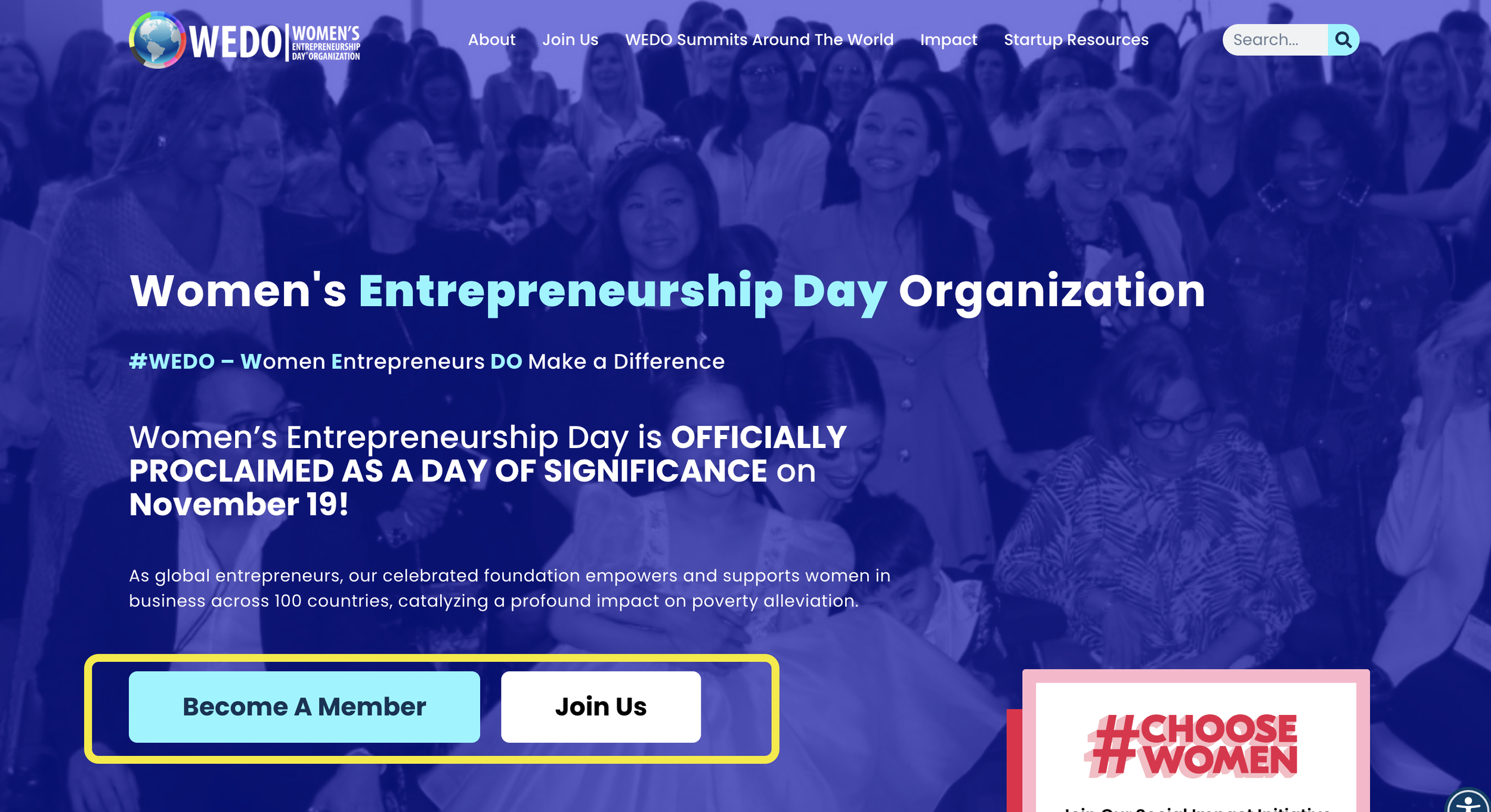
value propsitions
Problem: Many users felt they failed to understand what makes WEDO different from other women empowerment organizations from the homepage. Though they saw a lot of numbers and visuals, it lacked context and consciousness, resulting in confusion and quick exits.
Method:
Uniqueness: Emphasizing unique points allows the user to understand the product value proposition. For example, many organizations for women's empowerment focus on girls’ education, while WEDO focuses on women in business. Because of this unique factor, WEDO has helped women in hundreds of countries and has one of the largest global reaches. This point is now targeted in the home page.
Art of storytelling: Don’t tell the users you are helping women, show the users. Adding context, testimonials, and “whys and hows” can leave the user with a lasting impact.
Success metrics: We saw a 25% increase in user engagement post-launch, though this could be due to cumulative design changes. Additional qualitative testing would be needed to specifically understand the impact of value proposition.
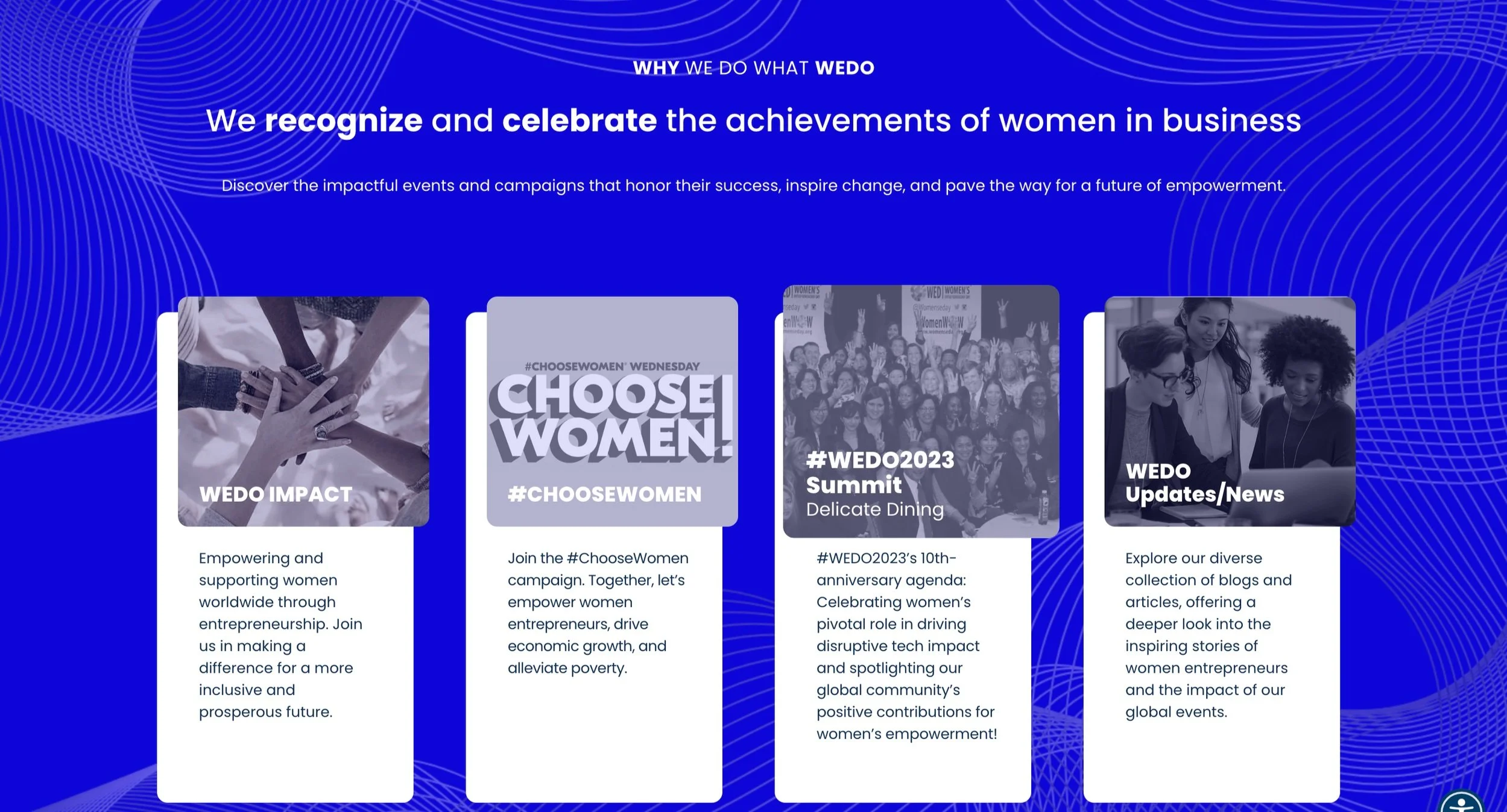
The new site (right) had value propositions called out on the homepage screen, communicating the WEDO brand more efficiently.
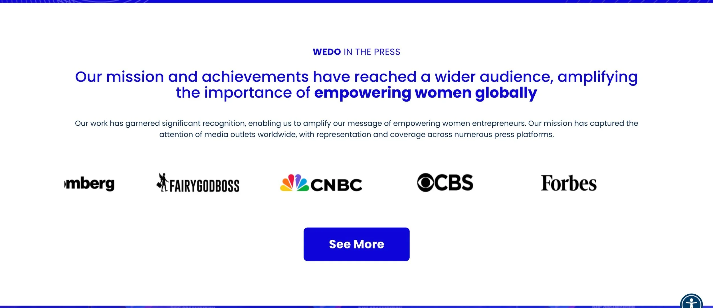
Additional value propositions added
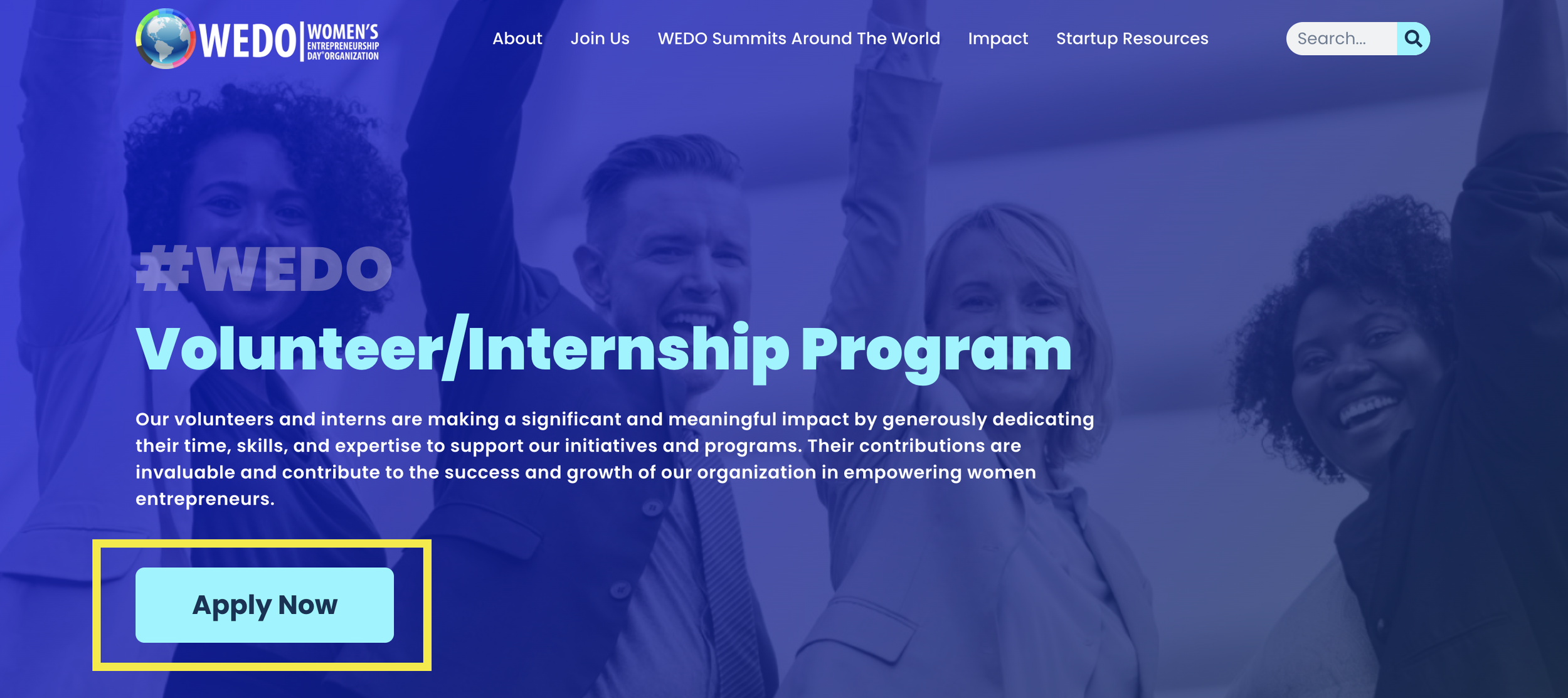
call to action
Problem: Users felt it took too much time to locate the call-to-action, which resulted in quick exits.
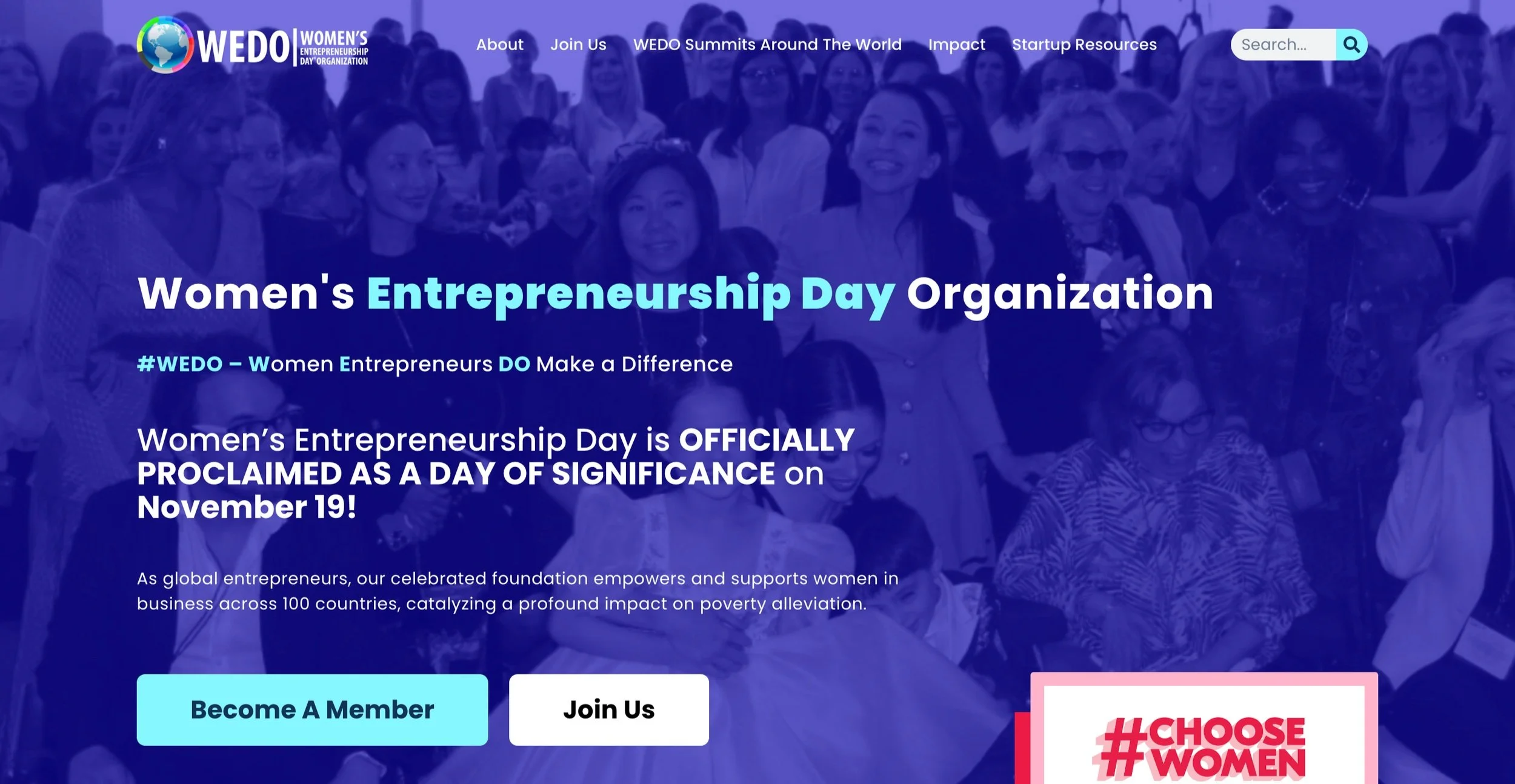
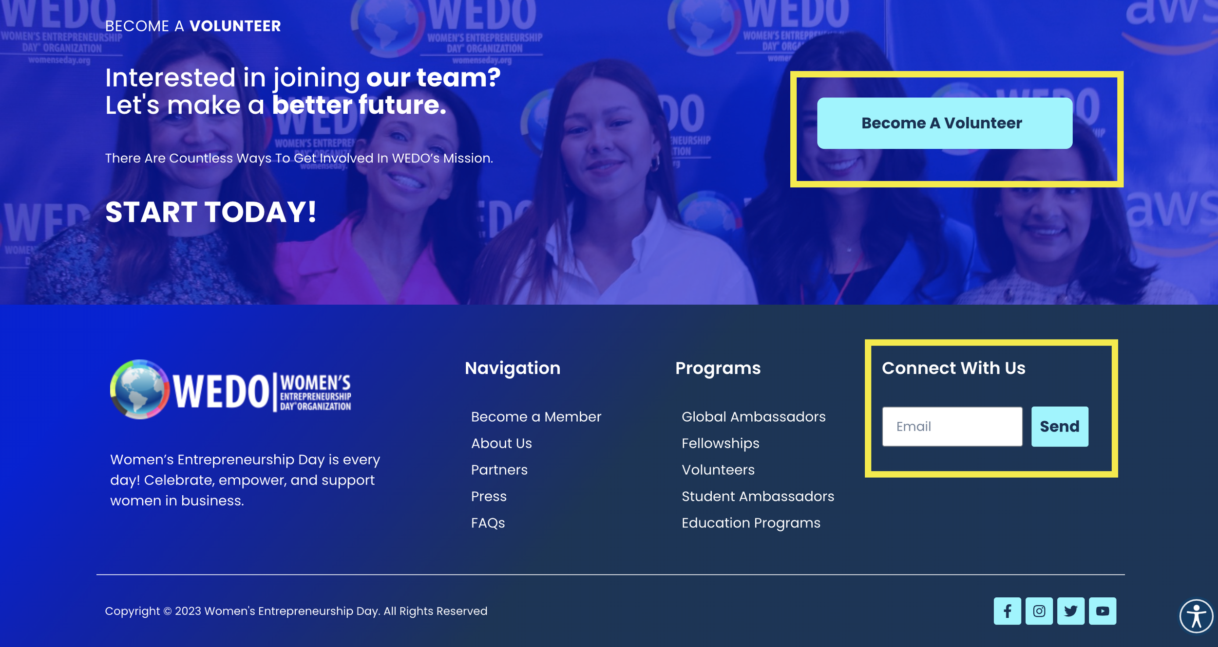
Utilizing user personas: Based on interviews and the creation of personas, we understood the majority of users were looking for volunteer and leadership roles in the organization. Thus we included this call-to-action in multiple places on the site, including the opening screen and footer.
Multiple Calls to Action- We also stratified our calls to action based on the level of involvement of the user. This allows users to get involved in the organization at a level they are comfortable with, rather than forcing them to make commitments on the spot. From lowest to highest commitment, call-to-actions included attending of the virtual conference, joining the email update list, and volunteering/ leadership of the organization.
Removal of Donor Button- This may seem counterintuitive, but we removed the donor button. Why? As of 2022, WEDO is only set up to receive online donations via crypto, with the exception of the annual New York summit. This meant 98% of donations were collected at the summit. While WEDO is in the process of getting cleared for USD donations, we removed this button to allow users to focus on getting involved in the organization, the primary goal of this redesign.
Success metrics: Post-launch we saw an increase of 40% in volunteer sign-ups and 15% in newsletter sign-ups compared to last year’s summit. Conference sign-ups cannot yet be measured.
Multiple, tiered call-to-actions found on the site
05
Impact
Post-launch in November 2021 we received great feedback on the site. The designs created were considered “modern, clean, and engaging.” The site did exceedingly well on all analytics tracked and we were successful in reducing our bounce rate and increasing engagement in the organization.
Feel free to reach out if you have any questions!