
Creating optimal b2b marketplace.
“When X % of marketplace GMV came from business buyers—but their conversion rate lagged by Y pp—I led a four-month, 16-iteration research sprint that cut search time Z %, boosted B2B conversion A %, and secured a $ B M contract renewal.”
My Role
Lead UX Researcher
Owned end-to-end research roadmap (16 iterations / 4 months)
Designed & moderated 32 sessions (interviews, usability, A/B, concept)
Synthesised insights in 24 h turn-arounds; delivered 8 executive readouts
Drove 3 roadmap pivots and secured $80 K research budget
01
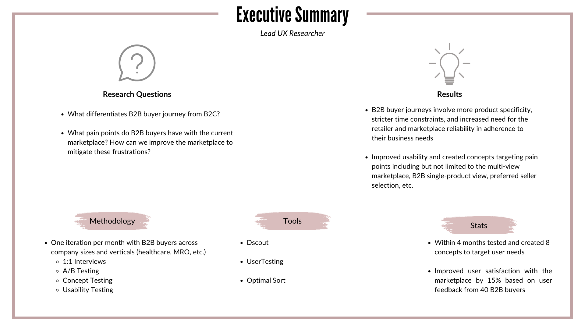
Problem statement
A leading B2B/B2C marketplace wanted to develop its site to better target its B2B users. Based on prior research, we understood that B2B shopping needs to differ from general shopping users. B2B products are specific, time-sensitive, and often repeat purchases. With B2B purchases making a substantial percentage of marketplace purchases, additional research was needed to understand B2B pain points and better target those needs.

02
research Plan
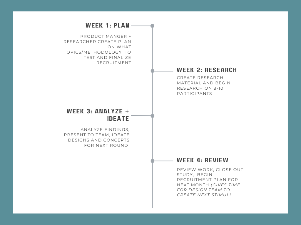
This was the first time research and development had centered around B2B users and thus we were starting from the ground up. This was designed to be an iterative 16-month project, with at least one iteration per month. Thus a new research plan was created each month based on research needs and concepts developed from the previous one.
We chose an iterative approach as we had multiple research goals that required generative, formative, and summative research methods.
Generative Goals:
Understand B2B needs and buyer journey
Draft and test concepts created to address pain points
Formative Goals:
Test usability of the current marketplace
Summative Goals:
Compare current and beta marketplace
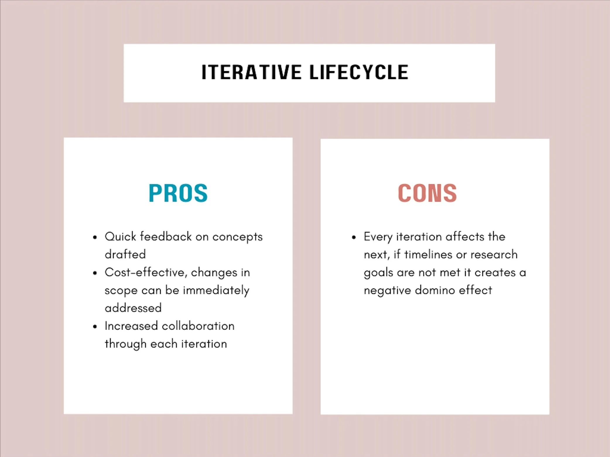
Our goal was to complete one iteration a month, which we ended up accomplishing due to our stringent schedule. As the UX Researcher, I primarily worked with the Product Manager to identify our research goals for that month and develop the methodology surrounding that. Additionally, I worked with the Project Management Team to recruit and schedule the right users. Once I’d completed my research and analysis, I presented my findings to the team. Based on the recommendations for concept development, the designers would create new concepts to be tested for the next month.
Recruitment targeted various types of B2B buyers in an attempt to match all user needs.
Examples below
Verticals
Healthcare (medical equipment)
Construction
Beauty (salons and cosmetics)
Office Supplies
Business Size
Small (<1500 employees)
Mid-Market Enterprise (1500-2000 employees)
Large Enterprise (>2000 employees)
Role
Business Owner
Office Manager
Operation/Sales Head
03
Methodology
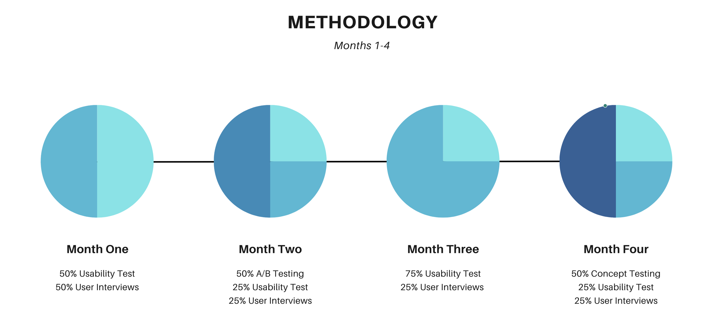
Every month, 8-10 participants were given different stimuli, tasks, and interview content based on our research goals. So far we have completed usability tests, concept tests, interviews, and A/B testing. Below is a very basic exemplification of our iteration process.
Month One
Goal: Set up foundational research on B2B buyer journey and test current experience
Process:
1:1 interviews with B2B users of marketplace covering topic such as user journey, product research process, retailer selection factors, marketplace selection factors etc.
Usability Test of product purchase on current marketplace to uncover likes/dislike
Brief Results + Next Steps
Current Experience performed moderately well, but users expressed pain points regarding time/effort for product selection, such as inefficient information displays, greater filtration process, sorting, etc.
Month two
Goal: Test different information layouts, additional current experience testing, and continue building foundational B2B research
Process:
A/B Test on various product information views and marketplace layouts
Usability Test of prototype with additional features
1:1 interviews on stimuli and B2B user journey
Brief Results + Next Steps
CE single-product display performed best but user interviews revealed there was still room for growth regarding targeting of important information like bulk pricing, affordable alternatives, etc.
Multiple layouts were prefered for marketplaces based on product attributes and knowledge
Month three
Goal: Test reception of Beta marketplace, a fully functioning site based on previous rounds’ feedback
Process:
Usability Test of Beta Marketplace with filtering, multiple image views, tags, comparison features, etc.
1:1 interviews on stimuli and B2B user journey
Brief Results + Next Steps
While user satisfaction in Marketplace improved, participants still had a distrust of marketplace based on perceived promoted sellers and products
Month four
Goal: Understand user reactions to Preferred Sellers and Exact Match concepts
Process:
Concept Test of Preferred Sellers and Exact Match
Usability Test of updated Beta Marketplace based on user feedback
1:1 interviews on stimuli and B2B user journey
Brief Results + Next Steps
Preffered Seller concept was successful but additional customization is needed
Exact Match concept needs additional interview information to meet needs of varying product types
04
highlighted Insights
Below are some of the highlighted insights and concepts developed over the course of 4 months. With each iteration, we were able to target different pain points and test our concepts with new users. There were additional insights on the buyer journey, additional concepts developed, and usability changes that I have not included but would be happy to discuss with you!
3 factors distinguish B2B buyer journeys
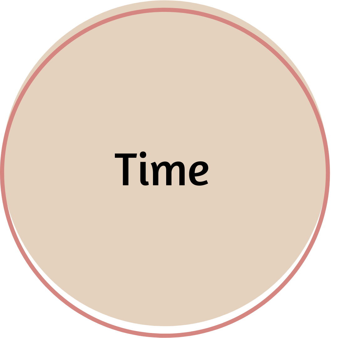
Time was repeatedly stated as the most critical factor in purchases. Product delays mean significant impacts to business revenue. Users were willing to compromise on product and delivery costs for speedy delivery times. Consequently, the marketplace was expected to provide information quickly, with minimal clicks to aid in rapid buyer requests.

B2B buyers do not engage in typical browsing processes (especially larger companies). They have specific criteria to fulfill and need the quick ability to locate these products. Different products also have different criteria to match, ranging from highly visual products (paint colors) to highly spec (screw type).
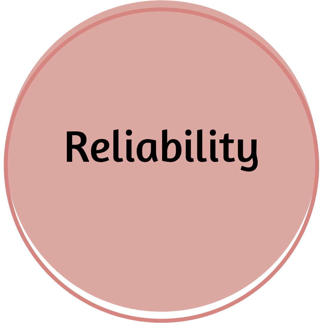
As many products are repeat purchases, reliability of vendors and marketplace is highly desired. Marketplaces reliability involved marketplaces that vetted retailers, yet did not promote/sponsor specific retailers. Vendor reliability was often based on business relationships and regulations.
While current experience did well on usability tests for simple task completion, users felt additional functionality could be added to minimize user effort and time in the research process
The most common way participants began their research process for unfamiliar products was by talking to people within their industry or the industry they were purchasing for. Participants trusted their peers’ opinions because they had professional knowledge to accurately review the product for business needs. Following obtaining peer recommendations, participants furthered their product research online, through Google, Youtube, or direct merchant sites. Finally, if necessary, they would contact a few trusted vendors and decide to purchase.
Pain Point
The overall pain point all participants had with their research process was the excessive number of steps it took to make an informed purchase. Specifically, they felt they were met with long product descriptions, biased reviews, and unhelpful product recommendations that took time to filter through and evaluate. Instead, they wanted to be directly connected with quick, relevant product information, like unique product features, that would allow for easy comparisons.

Design Strategy
Aside from basic usability edits, we also designed concepts that targeted these user needs:
Save time in product and retailer research amongst a breadth of products in landing page
Improve single-product display to clearly connect buyers with desired product attributes
Ease mistrust in the marketplace
Targeting speed in marketplace landing page
Marketplace Views Based on Product Type
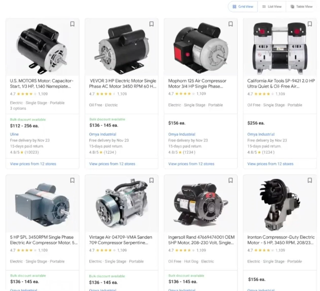
Users want to be connected to their product quicker, but searching through dozens of products on the marketplace landing page can be overwhelming as users have to click each product to verify specs. More so different products have different comparison attributes. Creating 3 versions of the marketplace landing that correlate with 3 product types (highly visual, high-spec, and mix) allows a more efficient selection process. Marketplace would automatically select the landing page based on product type but users have the ability to change the selection if needed. However, the research uncovered that users wanted to use multiple views even for the same product and had sequence preferences as well.
Grid View
Grid View was considered the overall SRP format preference for general use cases because of its scannability of key information and images. Participants found this view most helpful for low-complexity products and visual products.
Table View

Table View was considered the most helpful for products that had many variations or non-visual specs to match. Users also felt this was the easiest view to compare details of products because of the scannable table.
List View
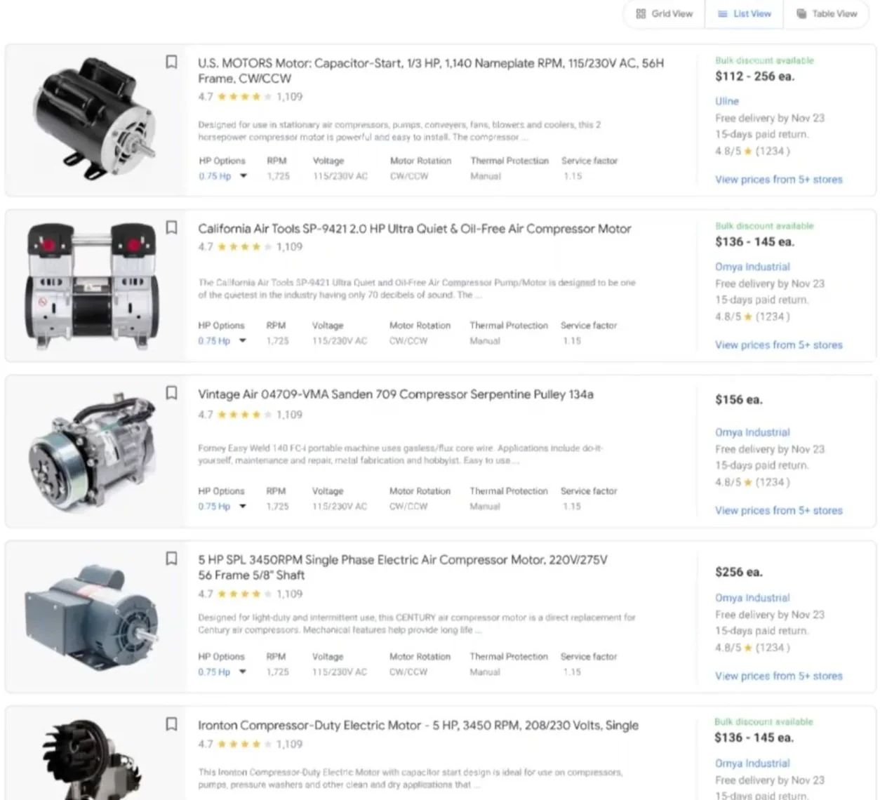
List View was considered the most helpful when participants wanted to research a few products in-depth because it contained both detailed specs and images. List View had the most polarizing views, as some users appreciated the large amount of product information while others felt it was information overload.
Factors influencing view preference
Influence of Product Type- Product type was the most influential factor in view preference (see above)
Product Category Knowledge-When users had high product knowledge, they preferred Grid View as they only needed basic information. When they had low product knowledge, they preferred List View as they could learn about the product from the product description and additional specs, like model variations. Table View was considered somewhat helpful for low product knowledge, as it provided an overall product category description but lacked individual product information on the SRP, like individual product images.
Factors influencing sequence preference
Sequence of Views- The sequence most users preferred was Grid View, List View, then Table view, as participants shifted from early phase to late phase shopping goals. Early-phase shoppers were still browsing for information across multiple products and hadn’t decided on one specific item. As a result, the 8-product display of Grid View was considered helpful for quick comparisons. As they narrowed down their product scope they wanted to understand the product in more detail with the additional description and images found in List View. Finally, when the products had been further narrowed to one or two, they wanted to compare the listed key specs on Table View before making a purchase.
Improving single-product display
Additional information in single-product display
The current single-product experience did not have enough information on the page for users to feel they were making a truly informed purchase. They did not feel it targeted enough information that would be relevant for B2B purchases such as bulk discounts or 3rd party sellers. To find this information many users would do additional research on the retailer’s site, which slowed down purchasing time. To address this we created additional tabs that provided information to the B2B buyer that was both more relevant and clear, without leaving the marketplace.
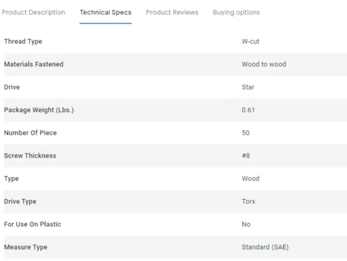
Technical Specs
Initial impressions to the technical specs information were mostly positive, with many participants stating “this is all the information I would need.” Participants appreciated information like installation, brand, and material. A few participants felt information like warranty, product title, and product image should be included within the technical specs chart for ease of comparison.
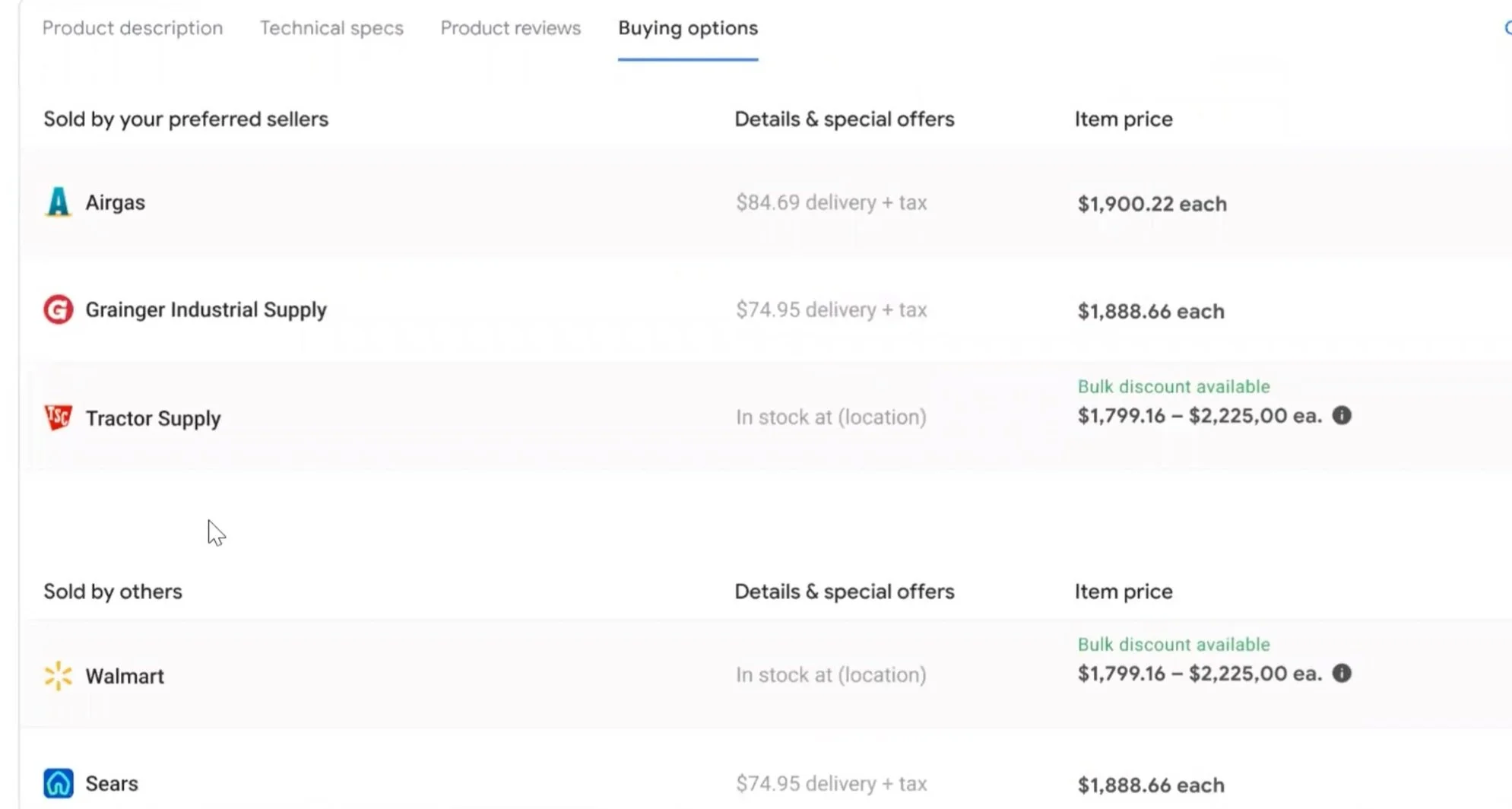
Buying Options
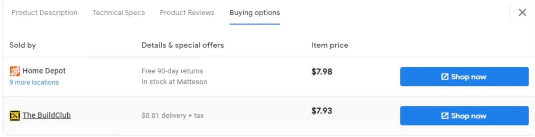
Third-party sellers were a common pain point for most participants. Participants were less likely to make purchases with third-party sellers because they related past experiences and distrusted their ability to provide on-time purchases, return policies, and fair pricing. A few were not allowed to use third-party sellers because their business was wary of biased purchases. As a result, some participants wanted to avoid third-party sellers and have them clearly marked on their SRP or ‘Buying Options.’
Bulk Discount
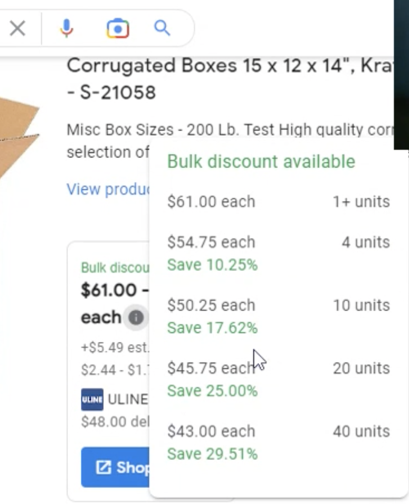
Once reaching the post-tap experience of the “i”, all participants appreciated seeing contextual information, like discount differences, to understand the price range displayed on the SRP. A few mentioned the percentage discount was helpful for simple price comparison. However, many felt that delivery and tax should be explicitly mentioned in case it varied by number of units. Some also found the term ‘unit’ to be confusing and wanted to see either price for total number of boxes, price per box, or price for a range of boxes per discount.
Improving marketplace trust
Creation of Prefered Sellers Dashboard
In current experience testing, distrust of the marketplace was mentioned by a few individuals when they noticed a lack of brand or retailer diversity. When common retailers, like Walmart, were not found on the SRP, they assumed the marketplace was intentionally hiding Walmart to promote other retailers. This was considered a major roadblock as users wanted to see all options available and decide retailers and brands themselves, rather than being fed the retailers or brands they assumed Marketplace was being paid to promote. But simply increasing diversity did not perform well on user tests because users felt it took them longer to find retailers/brands they were familiar with or trusted. However, user interviews revealed that all users had a preferred or familiar sellers list after developing relationships with trusted vendors that consistently provided high-quality products, great customer service, and reliable delivery times. Thus, we added functionality in which users could set up Preferred Sellers, which would automatically populate preferred sellers at the top of their SRP for subsequent purchases.
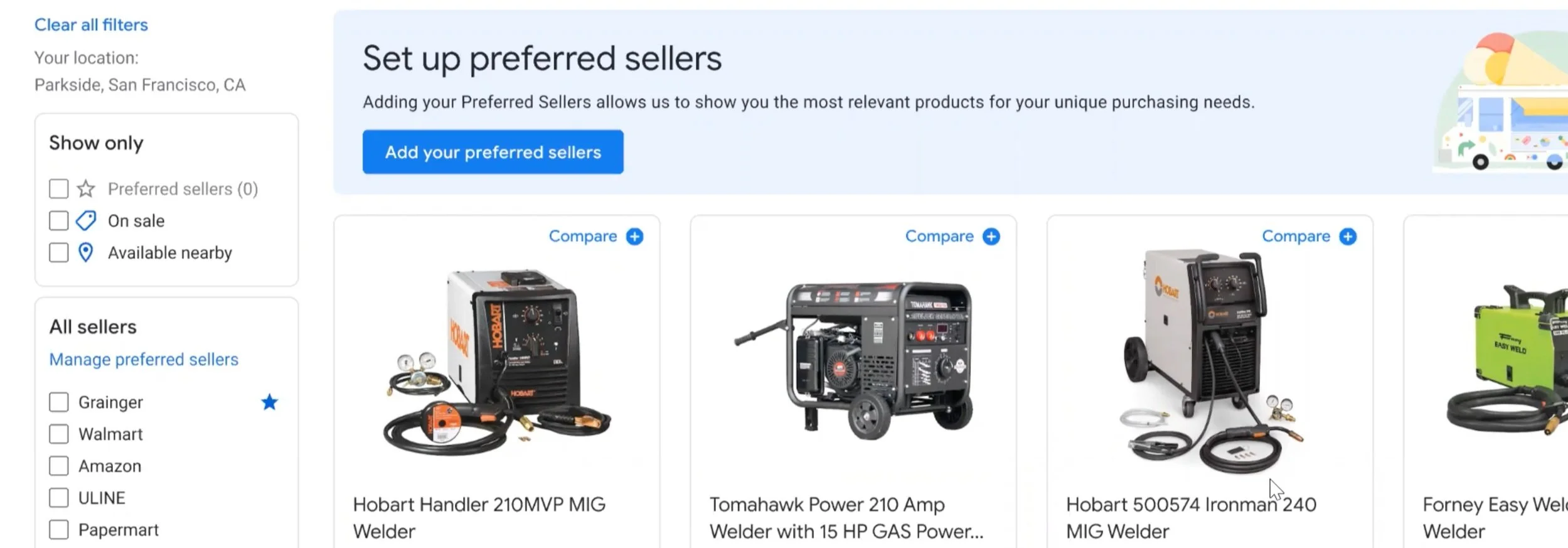
User flow begins with a tutorial feature to alert users of Preferred Seller’s functionality. On the left-hand side, there is also free-flow option so users can select from the marketplace landing page itself.
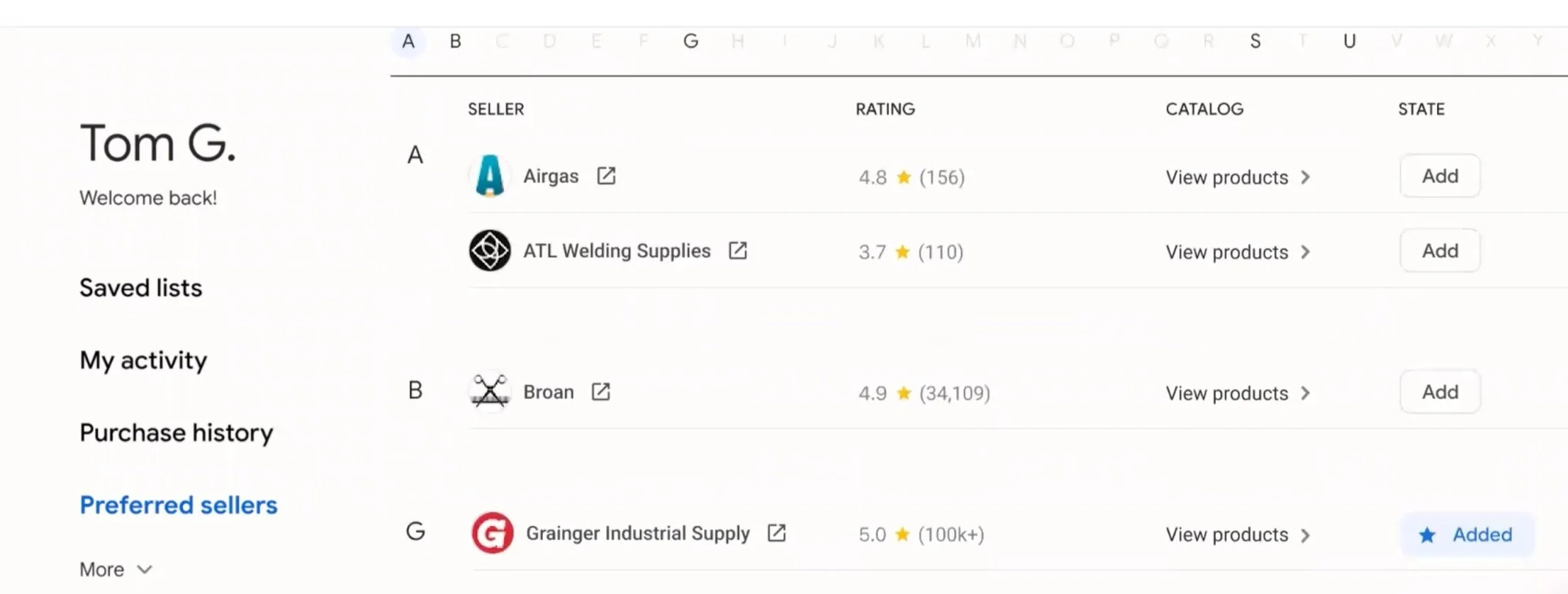
2. Users are taken to a dashboard where they can select their preferred sellers from the list.
3. Users now will see preferred seller retails populate first on the marketplace and sellers in the single-product display. They also have the ability to view only products by preferred sellers.
All indicated they would set up Preferred sellers (Ps) for their products as it saved time spent researching sellers or filtering irrelevant products. In the ‘Show only- Preferred sellers’ tab, the ability to compare PS products side-by-side allowed participants to focus on details like price or delivery time.
However, some additional customization was required by users.
Fear of Missing Products- Participants feared they might miss non-PS products that might be cheaper or with quicker delivery. To mitigate, some suggested an option to see PS and non-PS products on one page with the PS products highlighted at the top.
Need for Product Category Differences- Since many had different PS for different product categories, some wanted the ability to select and separate PS by product categories to finely tune their preferences (i.e. Grainger for construction, Walmart for office supplies).
Thus additional iterations on this concept will resume.
05
Impact & Next Steps
These iterations were part of a bid project to improve the current experience and eventually develop a specialized subset of the marketplace targeted to B2B buyers. While we did secure the contract, the project was paused until 2024 due to FAANG layoffs. In the meantime, I am currently working on a number of projects targeting e-commerce developments, user usage of smartwatches, and more! Please reach out if you would like to discuss.

Next Steps
Additional Testing on Preferred Sellers to understand more about customization requirements, learnability of dashboard vs. free-flow method, and usability testing.

Development of the Exact Match Concept (marketplace providing specific substitutions when an exact product is not available based on user purchase history and preferences), which got mixed reviews in concept testing. Users appreciated the idea but felt customization would have to be extremely nuanced to be useful.
Additional testing and focusing on uncovering differences in buyer journeys across verticals and sizes, to influence a more specific, user-centric design strategy.
Please reach out if you have any questions!