
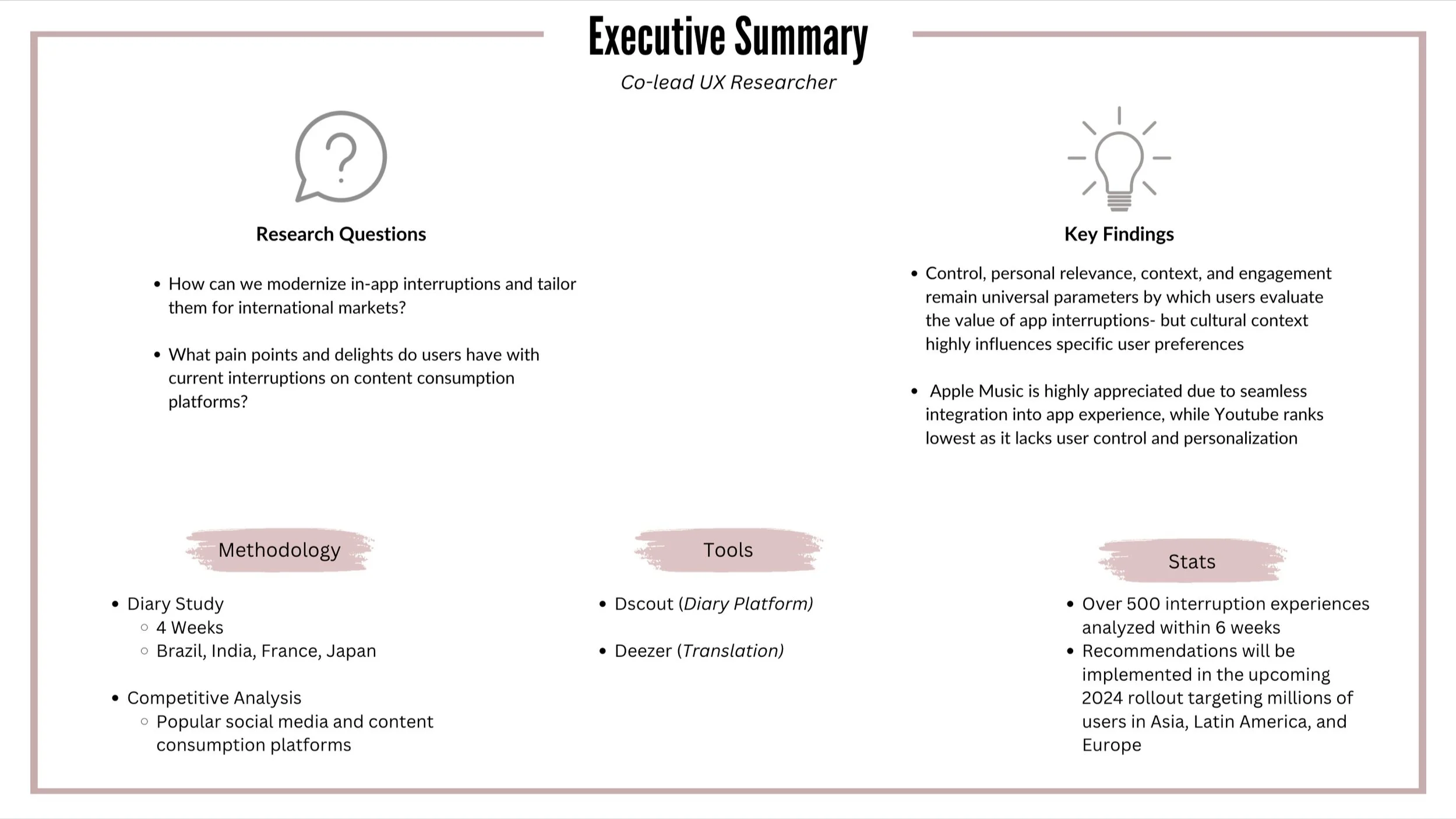
Modernizing App Interruptions.
01
Problem statement
App interruptions: unexpected suggestions designed to help the user’s experience. You’ve definitely seen them before, even if you don’t always register them. Examples include Facebook suggesting friends to add, Instagram suggesting reels to create, or Tiktok suggesting you allow access to your contacts. These interruptions can incite a wide range of emotional responses in its users, from irritation to ambivalence to delight. What factors influence the emotional response from the user? And how can we use this to optimize the app experience?
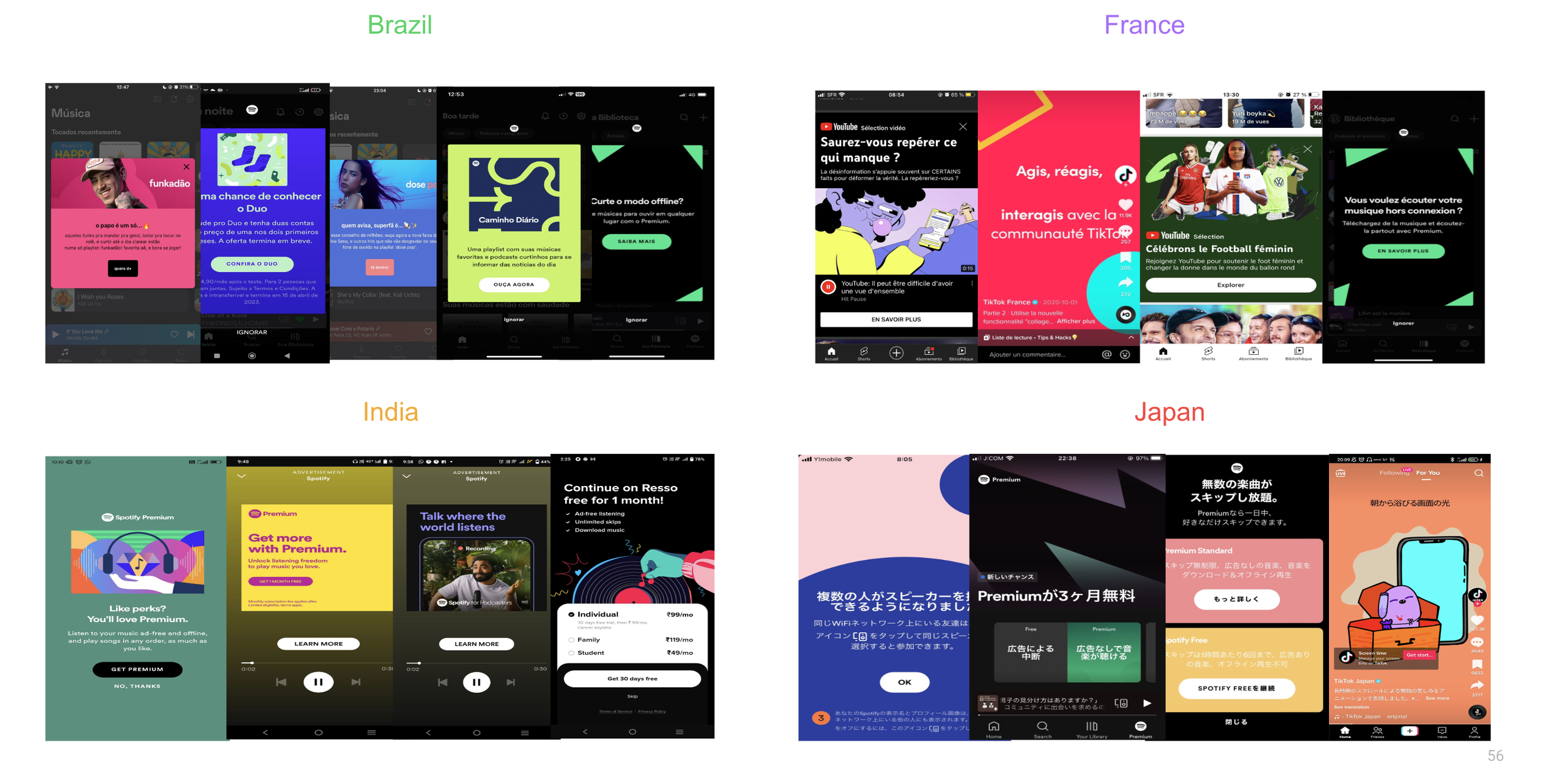
Examples of App Interruptions
02
research Plan
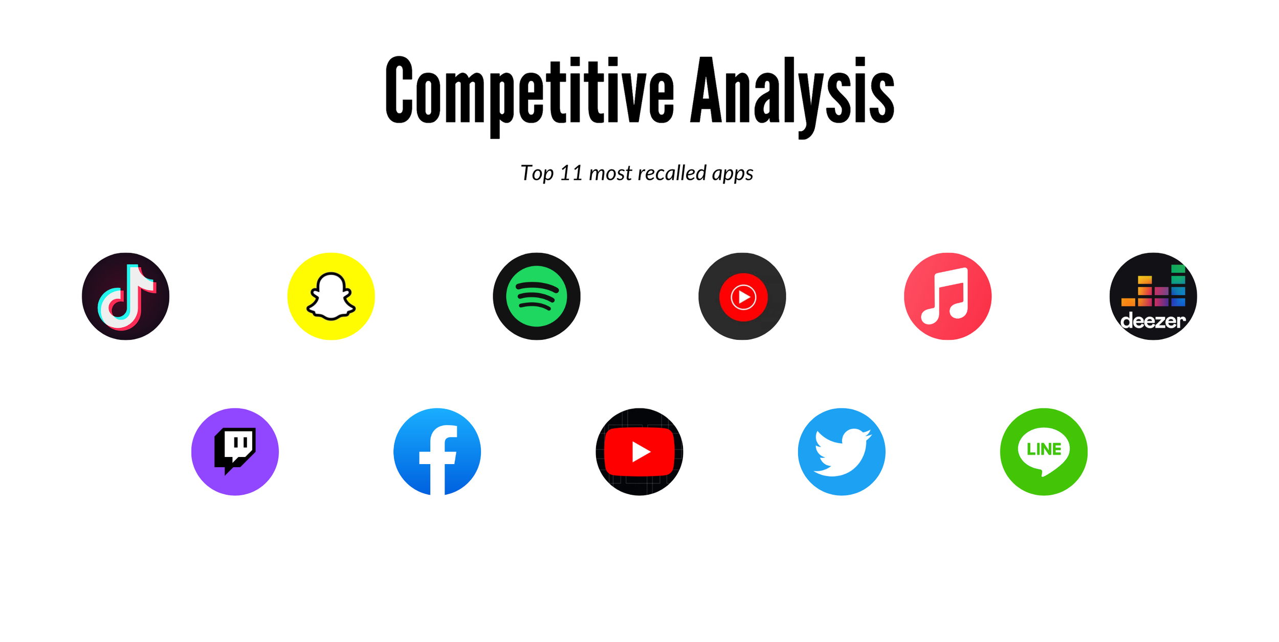
This was the project's second iteration, the first consisting of only US users. With this round, we wanted to target international markets to uncover nuances based on cultural preference. Additionally, we created a competitive analysis to understand competitors’ strategies and efficiencies in creating a positive user experience.
Why we chose this methodology
Benefits of a diary study
Most natural observation of participants’ experiences allows more specificity and personalization of data
Allows a large variety of experiences to be evaluated with minimal effort from the participant
International markets can be researched with minimal translation issues
+
Benefits of a competitive analysis
By identifying the design and marketing of successful app interruptions on other platforms, it can minimize resources spent on additional testing and development
Can identify biggest weaknesses of client experience compared to competitors, aiding in prioritization of actionable insights
=
Comprehensive evaluation and strategy development of client app experience
Specifics of Our Study


03
Process
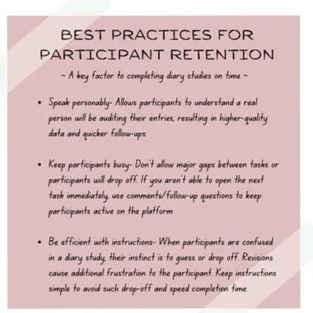
Diary studies provide you with an abundance of data. But this won’t always correlate to actionable insights if you aren’t strategic about the decoding and analyzing process. We meticulously combed through 100s of data points, managed recruitment and retention of participants, and combated the difficulties of international studies. Each entry was processed by three rounds of review, targeting different parts of our analysis process to ensure no stone was left unturned.
Round 1: Translation and Transcribing
3 of our 4 markets were non-English, thus our first goal was translation. As of now, Dscout does not offer translation capabilities so we had to utilize a 3rd party translator. Four methods were used
Dscout Tranlation Extension- translating text and video transcriptions.
Google Translate Simultaneous Translation- translating direct and live video
Google Image Translator- traslating text found on images
Direct communication with participant- last resort when data was particularly challenging to decode
Data was then stored in our drive and off the Dscout platform. The goal of this round was to simply have easy accessibility to translated data and dip our toes in.
Round 2: Digging into Data
The first thing we did was tag our data by key demographics like age, technology level, and gender. While cultural nuance was our focus, being able to identify demographic trends early helped to better frame the story. Next, we highlighted, summarized, and completed the basic tagging of our data. At this point, we were able to get a general idea of what the users felt about their uploaded interruption.
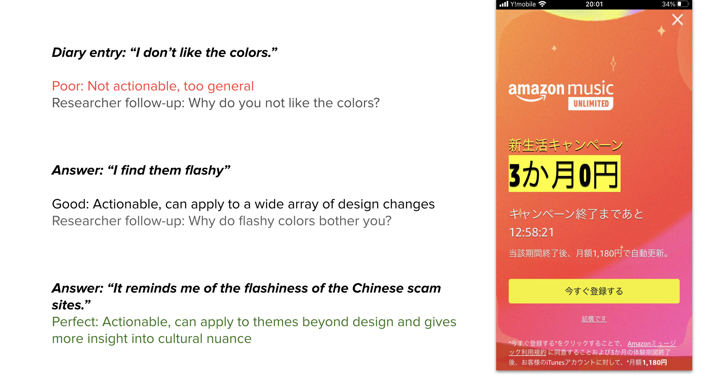
But a general idea does not translate to an actionable insight.
Most participants enter their diaries by appreciating or complaining, which tells us what they feel but lacks the why. You have to pull the data from the participants by utilizing comments as follow-up questions. Always seek specificity and think “If I was the designer/project manager/marketing team how could I act on this insight?”
Round 3: Identifying the Trends
Once participants answered the follow-up comments, final tags were placed and the deep dive of analysis could begin. My process of analysis went like this.
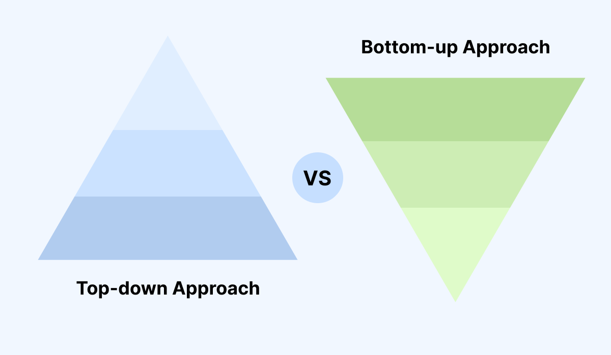
Bottom-up Analysis: Begin by looking at all the data at once. Note down any obvious themes that are jumping right at you based on bigger themes we are trying to address. How do participants generally feel about these interruptions? Is this consistent? How strong are their feelings?
Top-down Analysis- Start with the specific tags and derive insights from those tags. If a tag was #Design, what are participants liking or disliking about interruption design? Colors? Graphics? Something else?
Revise Bottom-up Analysis- Finally, revise the data again and again in different orders to prevent data blindness. Different insights might still jump out once you adjust your perspective.
04
Insights
Factors affecting experiences with first-party interruptions are consistent with previous research; perceptions are primarily driven by how contextually and personally relevant the first-party interruptions are. Getting relevance and context right is essential to establish a meaningful connection and exchange with the user. A sense of control and engagement displays the power to lend a positive experience that influences the overall FPI and the app experience.
4 key parameters were revealed to be the influencers of user reception of app interruptions
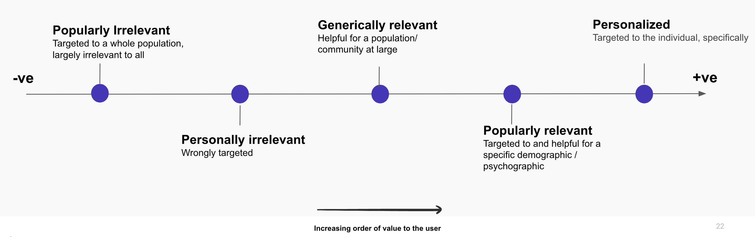
Personal Relevance (What is in it for me?)
Contextual Relevance (It makes sense!)
Control (I’ll do what I want!)
Engagement (It looks interesting!)
Breaking this down…
Personal relevance
the primary factor influencing users’ response to any app interruption. In ascending order of relevance, interruptions are seen as…
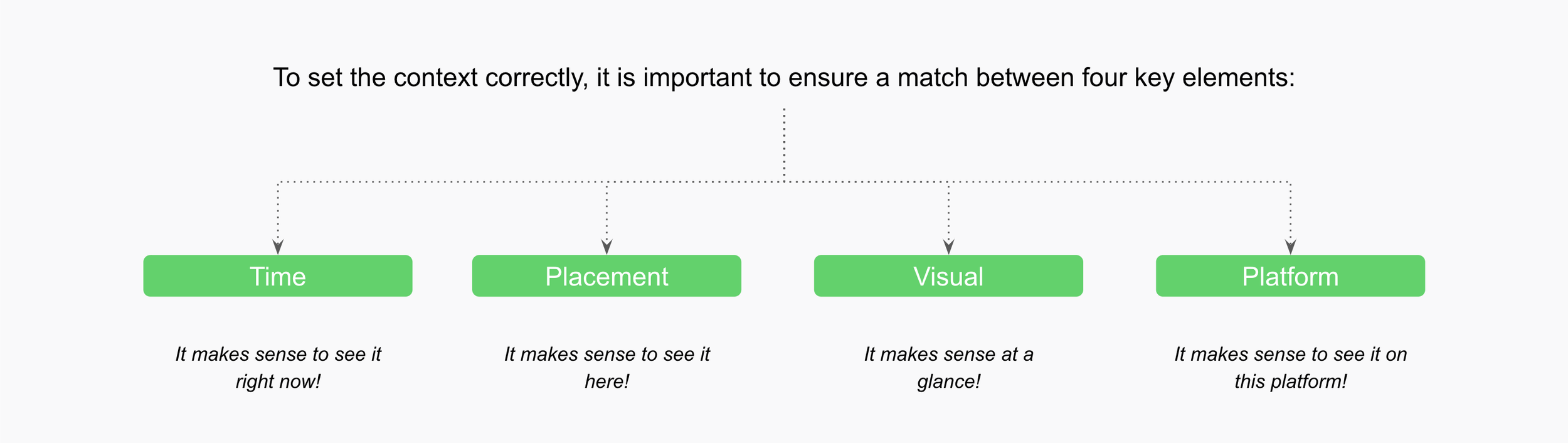
Contextual relevance
the factor that helps communicate value proposition more effectively and prevents coming across as a literal “interruption.”

Control
makes application use easy, letting the user do what they want, when they want, and makes the overall app experience more pleasant
Engagement
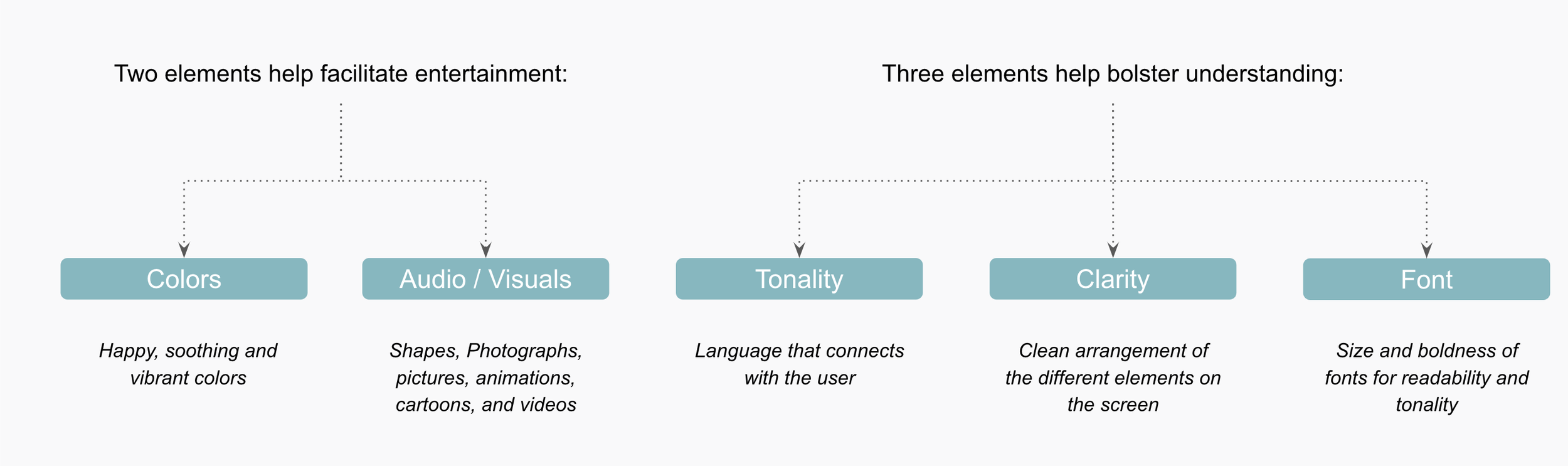
helps grab initial attention and adds value to the app experience. It entails two factors - entertainment and understanding.

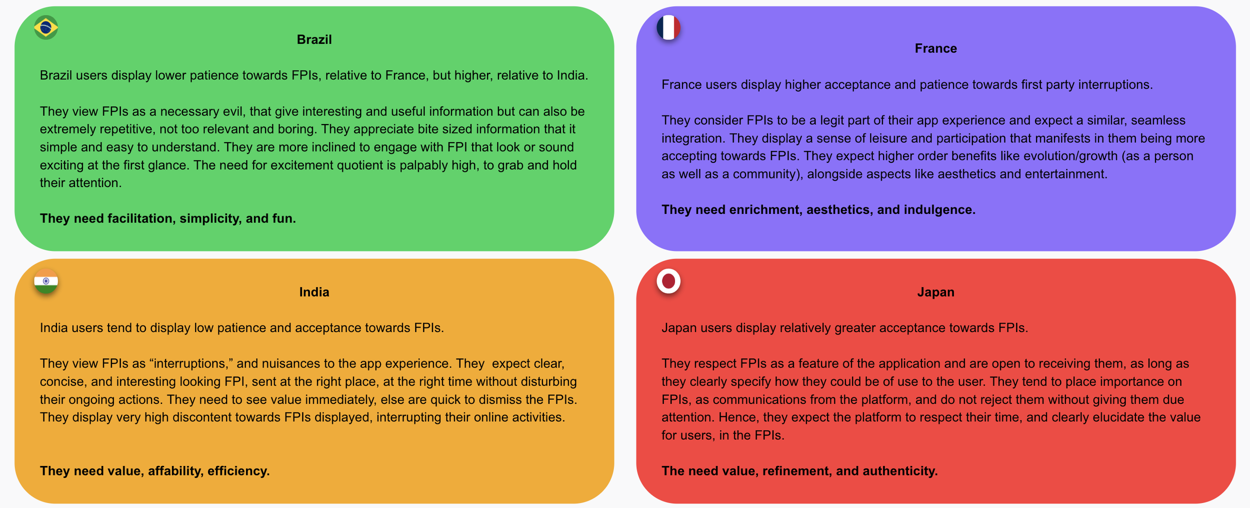
The 4 markets explored displayed different attitudes and requirements
Competitive Analysis
Apple Music does exceptionally well across all four pillars:
It displays generically relevant as well as intuitive FPIs.
Does not interfere with the ongoing user activity and is perceived as non-disruptive suggestions.
Concise and clear in explaining the proposition and uses colors, icons, and some graphics for visual appeal.
YouTube FPIs on the other hand were viewed as app-centric (subscriptions) rather than user centric, popping up too frequently, disrupting ongoing user actions, and visually dull (black and white, without any graphics, mostly lists).
05
Impact & Next Steps
The exact impact of the research can not be measured yet as recommendations will not be implemented until the 2024 rollout targeting millions of users internationally. However, the lead marketing, UX, and Project management team attended the readout for Latin American, Asian, and European markets. The client was very impressed by our work and called it “the best vendor experience” she had ever had.

More Markets
Repeating the study with other markets would allow us to identify additional country-specific trends as well as trends amongst sub-regions (i.e. East Asia- China, Japan, South Korea, etc.)

A/B Testing
A/B testing could validate the design, language, and other recommendations presented in the deck. Additionally, it can provide a direct comparison between platform interruptions.

Follow-up IDI’s
Follow-up in-depth interviews could provide more clarity to the user journey and cultural nuances behind user preferences. The additional detail could better target marketing in alternative products as well.
Please reach out if you have any questions!